The initial ask
In our first kick off meeting, the Ability@ team shared their challenges in maintaining their network webpage.
It was too time consuming to update with relevant information; it is hosted on Google Sites which has its technical limitations; there is no budget to update the outdated content.
Interpreting the ask
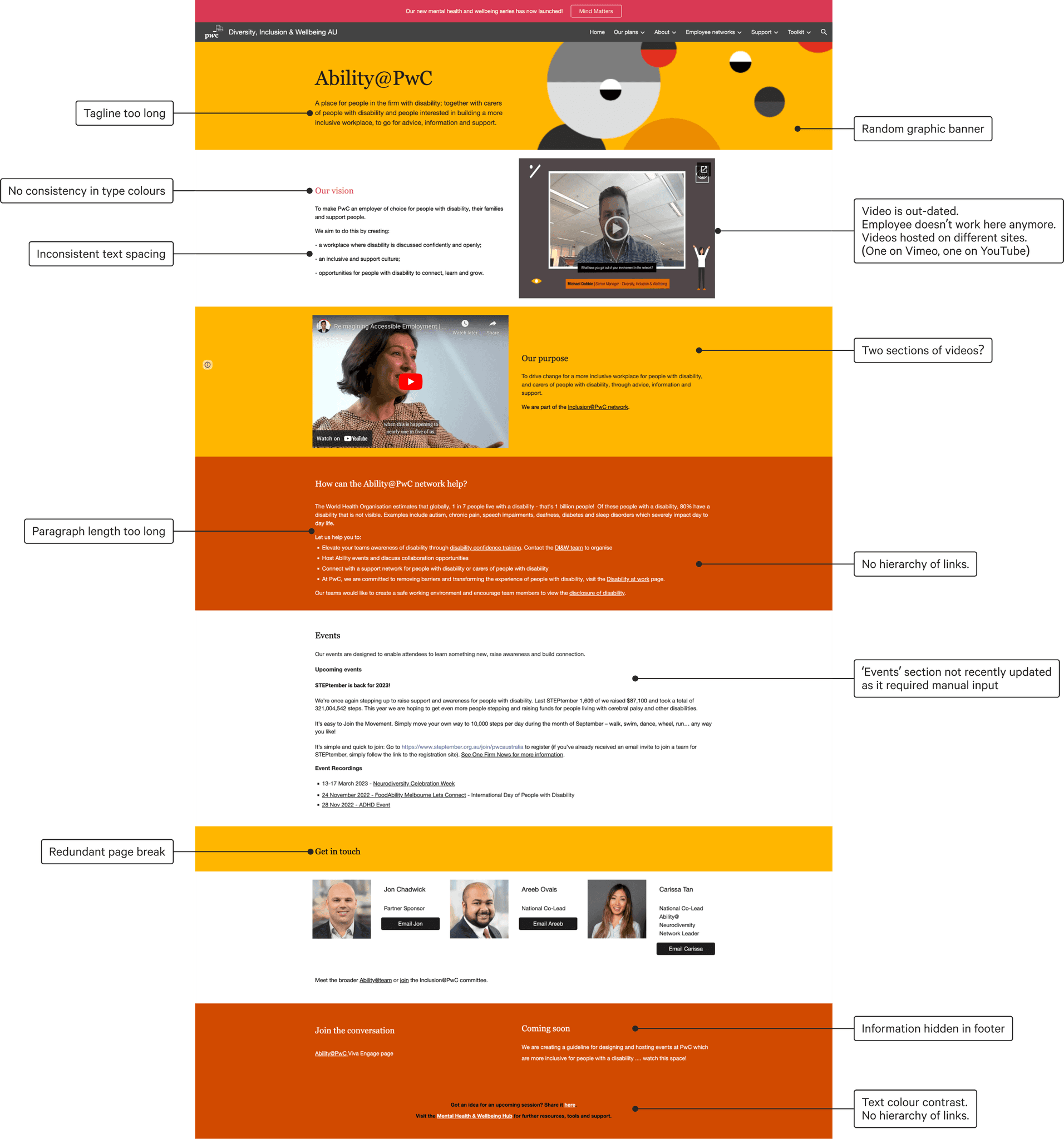
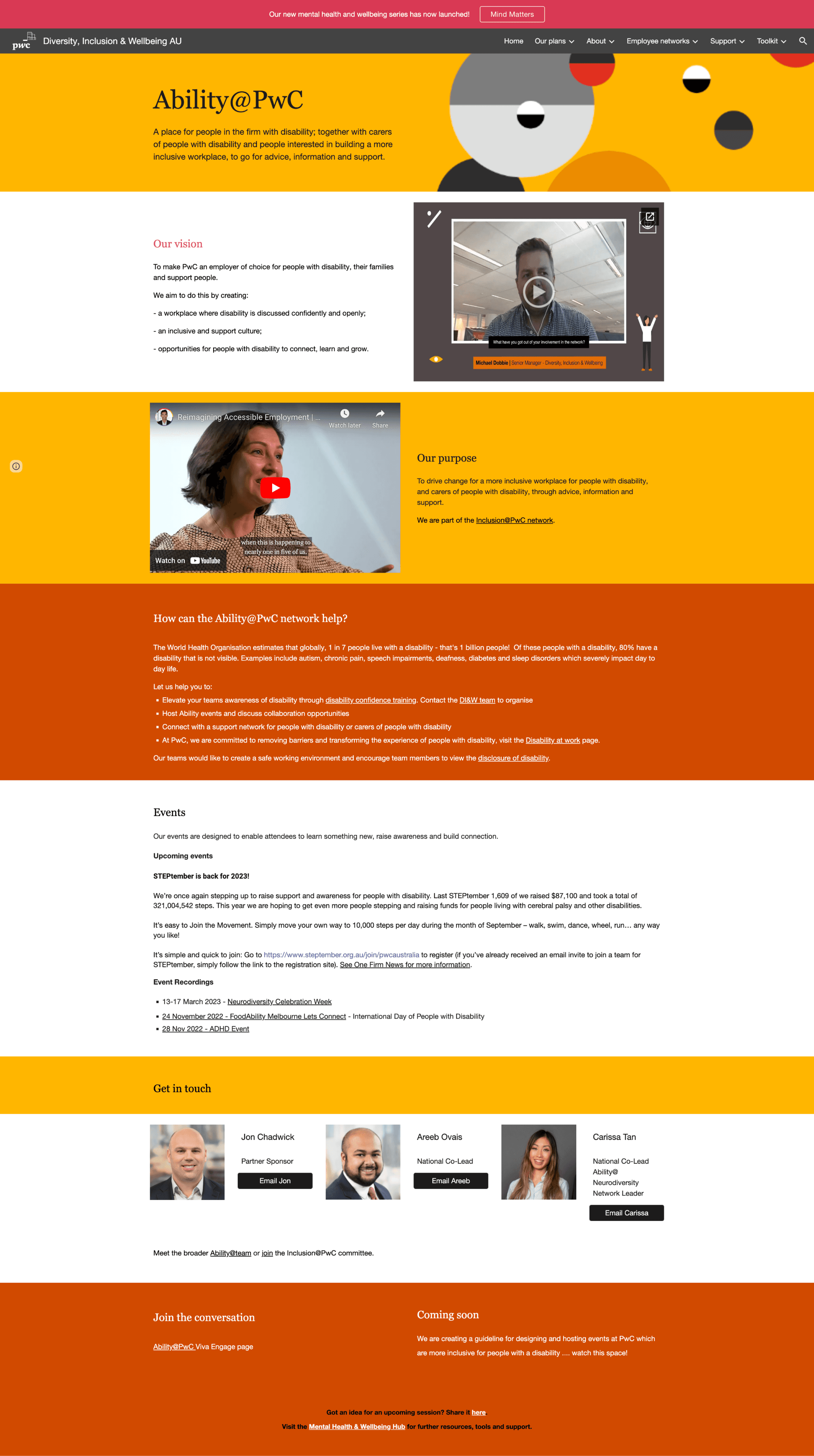
I did an initial page review of both the visual design and content structures of the page to understand where the page is currently at so that I can craft impactful recommendations.
Existing page review
Defining three horizons
It was clear in the page review that the content was not well organised; mixing more general content with content more suitable for network members.
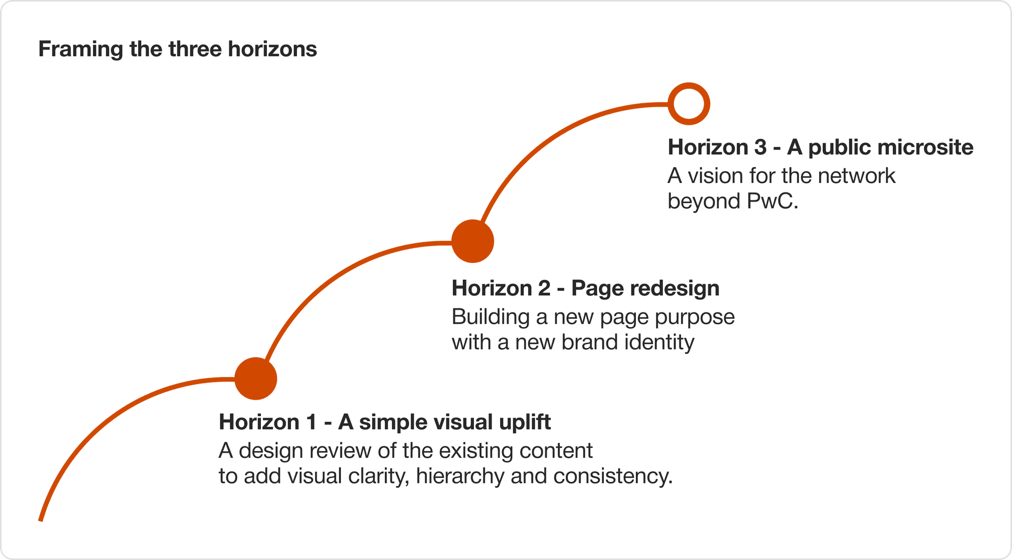
It was an important thing to fix. However since this was a volunteer-run network, it was a secondary priority to other work commitments. As such, I defined three horizons that would guide my design work so that I could quickly deliver value with the time I could allocate to it, while working towards a clear vision.
Horizon 1
Executing a simple visual uplift
as a quick win
Due to the permissions of the existing Google Site, I was not able to obtain edit access. The proposed design would have to be simple enough for Ability@ to update.
The simple visual uplift would be a built using Google Site's out-of-the-box components.
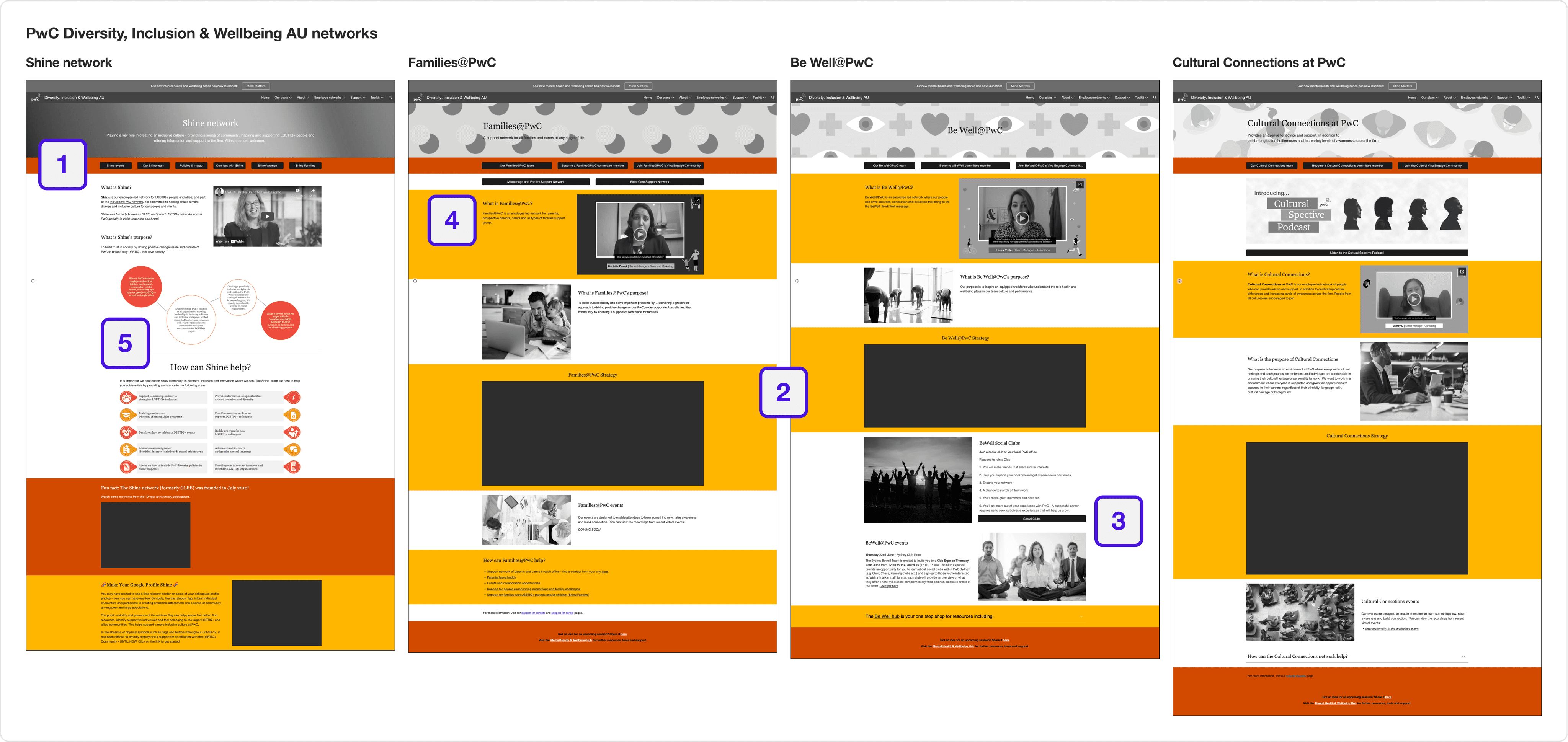
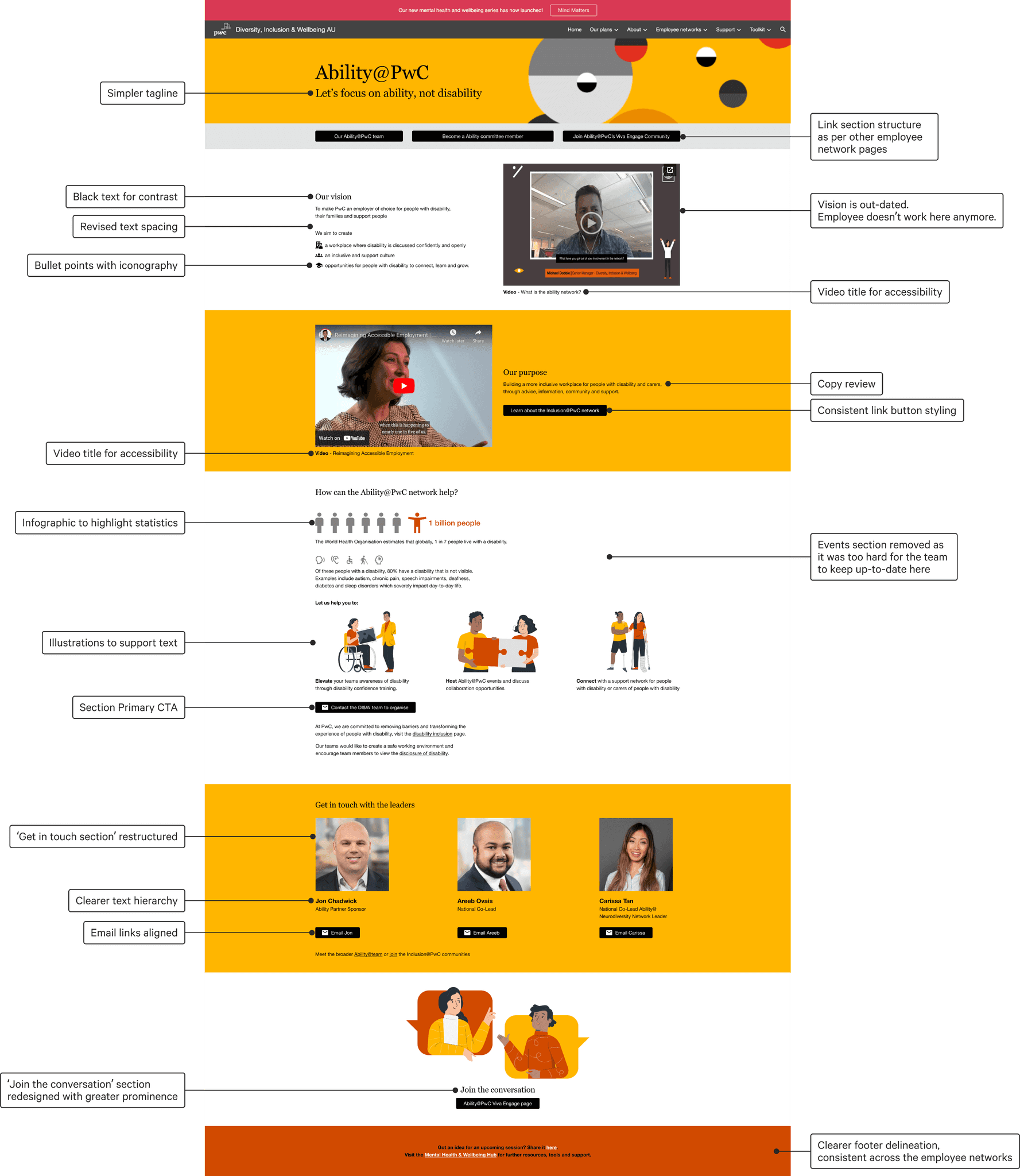
Aligning the design with other employee network pages
I noticed while reviewing other network pages that there were design elements that were consistent that could be implemented back into the Ability@ page.
1. A bar that contained key link buttons under the title banner
2. Background sections were predominantly yellow or white
3. Black coloured link buttons
4. Typography was predominantly black
5. Iconography & diagrams to break up the body text
Applying best practice design principles
to improve readability
Other design changes I recommended were to:
- simplify the text,
- shorten the paragraph width,
- add illustrations to break up the text,
- define a consistency use of colour (accessibility)
- define a type scale (accessibility)
- define a consistent user of spacing spacing
before
After
Aligning the design with other employee network pages.
Applying best practice design principles to improve readability.
Horizon 1 outcome
The recommendations were well received and I worked with one of the Ability@ members to implement the changes to the Google Site which went live within a day.
We decided to leave the design at this point as one of the Ability@ leads was going on leave.
Horizon 2
A new beginning
A few weeks later, the Ability@ team caught wind of a new Access and Inclusion plan that would soon be announced. This was the perfect opportunity to invest more time in thinking how the page could be redesigned to provide ongoing value for all employees.
A page useful for everyone
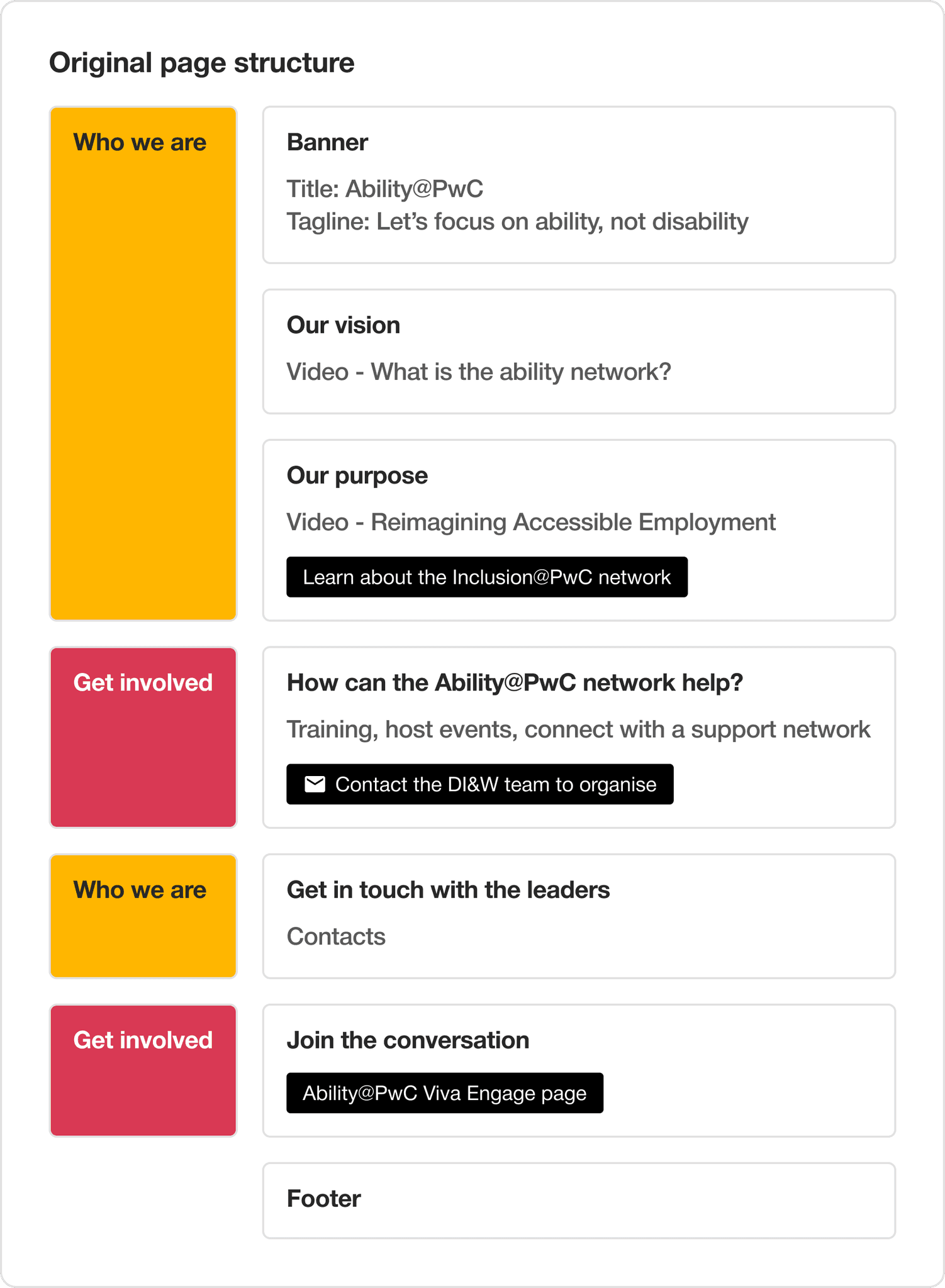
One of the challenges we found with the existing page structure was that the top three sections were dedicated to explaining what Ability@ is. This meant that visitors of this page would constantly have to scroll to access the critical links below.
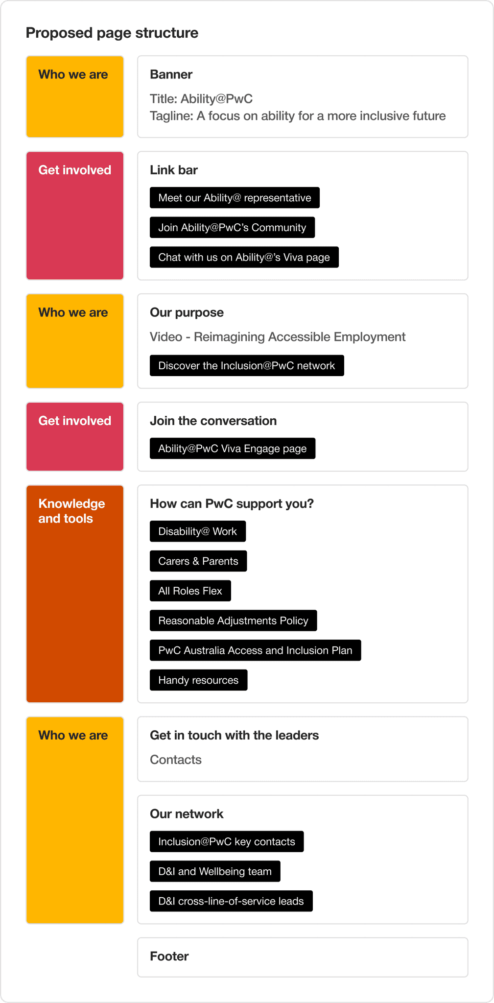
For the page to be useful, the site needed to do three things:
- explain Ability@'s purpose,
- direct people on how people can get involved,
- provide access to knowledge and tools.

Original page structure
Content: Primarily descriptive, get involved requires email
Purpose: Educate people about Ability@
New page structure
Content: Links to up-to-date resources & chat community
Purpose: Support with learning, resources and getting involved
Crafting a new employee network personality
The brand words reflect the core vision of the network:
To make PwC an employer of choice for people with disability, their families and support people.

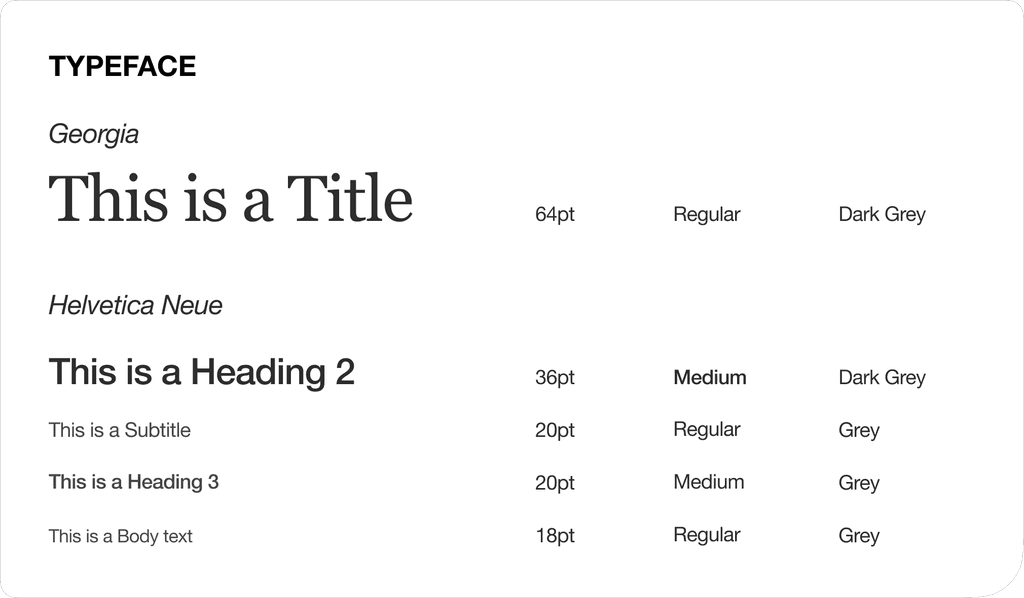
building the new typescale
Typographic style sheets based on global brand requirements.
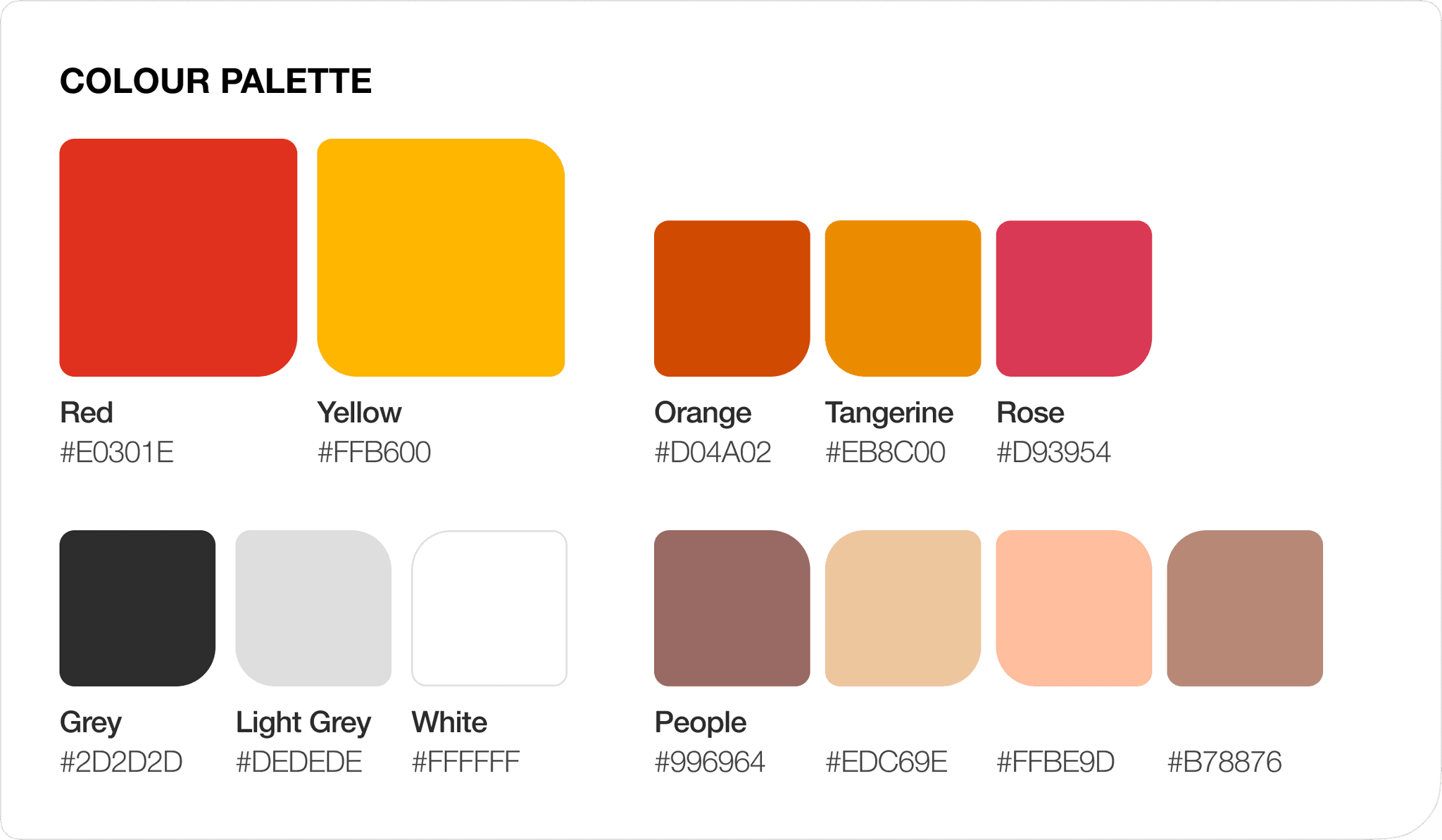
Brand colour selection
Using the global brand colour suite, I selected vibrant contrasting colours to suit the new brand personality.
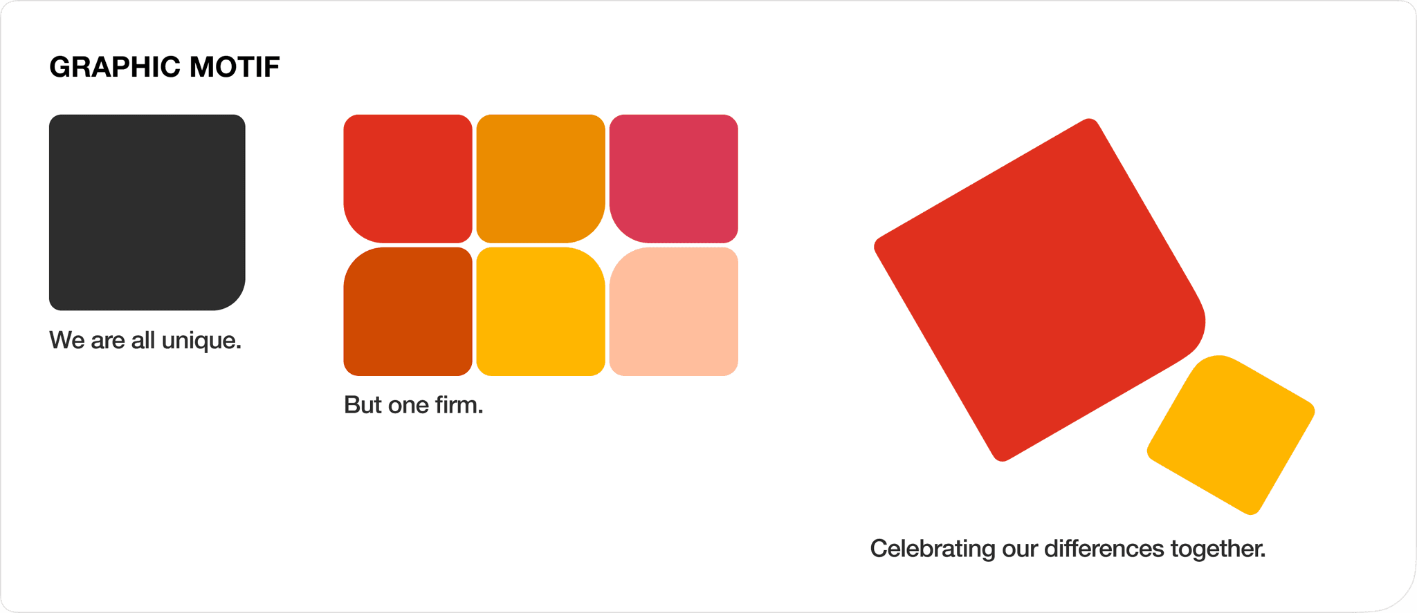
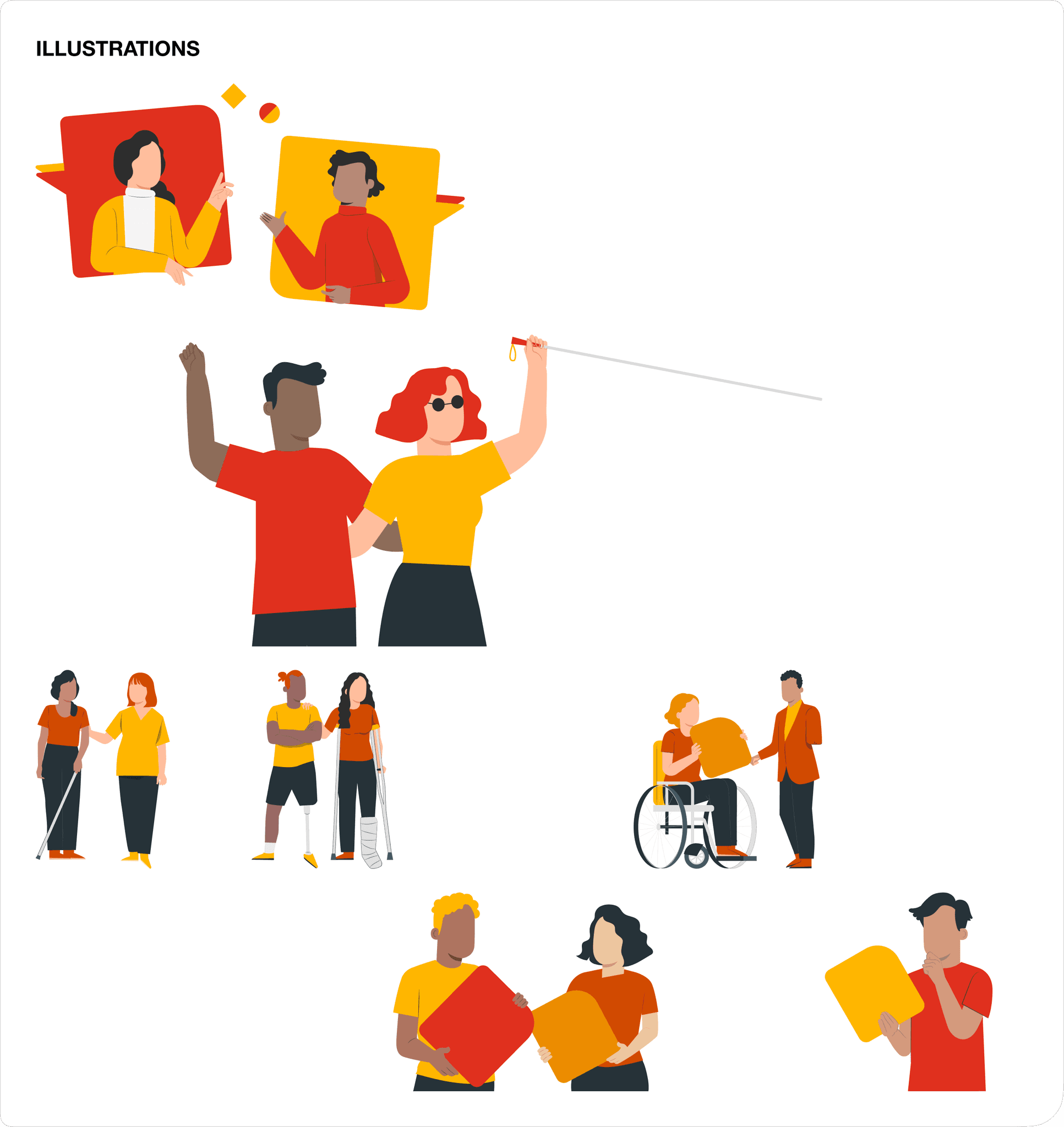
Illustrations
I built a graphic motif out of an oddly-shaped rounded square to represent the uniqueness out every community member's ability.
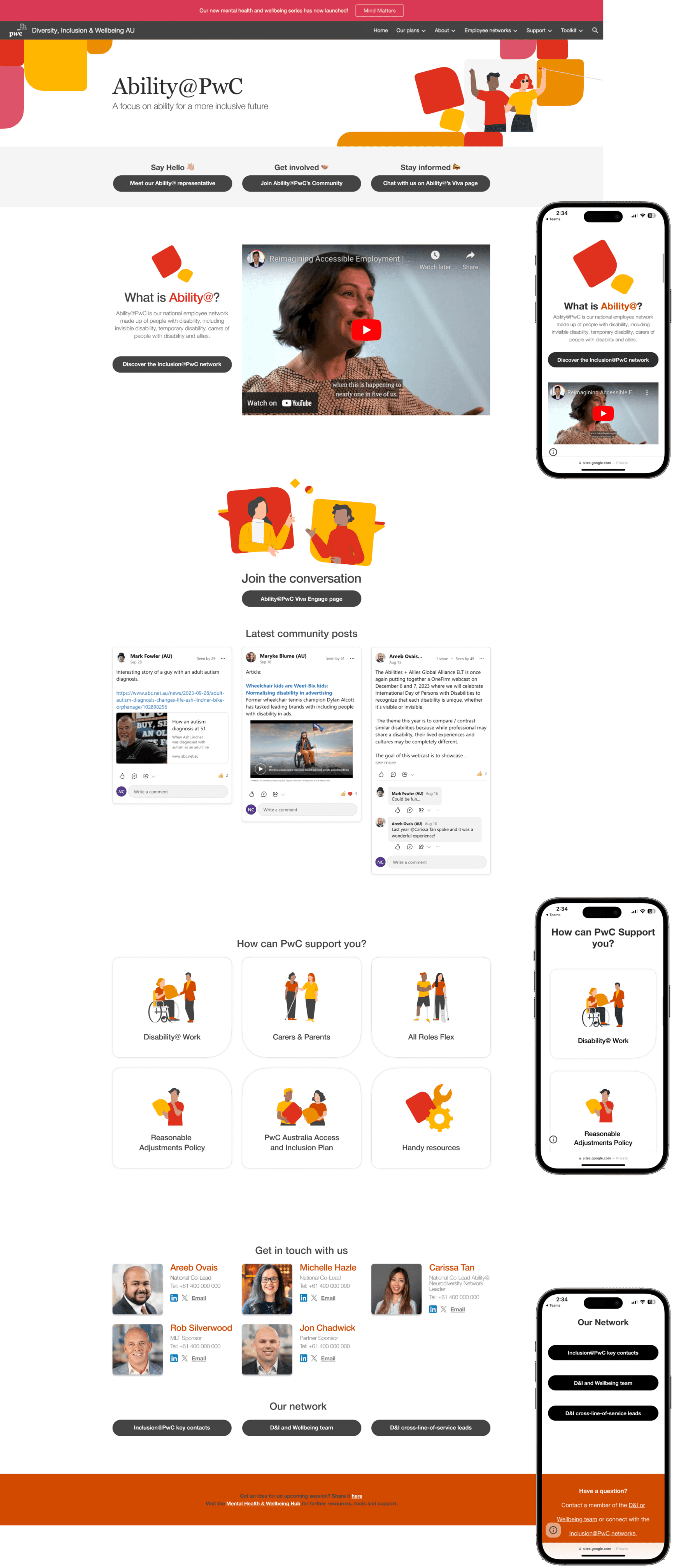
The new site - a launch pad to up-to-date resources
Because resources already existed elsewhere, I reframed the site's purpose in directing visitors to the right place.
This reduces the page content eases ongoing site management.
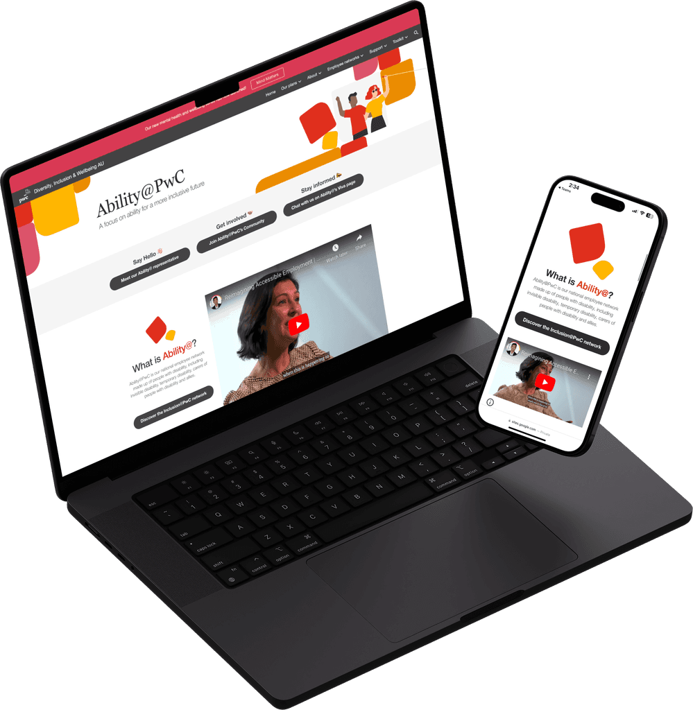
Final execution on desktop and mobile
Feedback from the Ability@ team
Areeb Ovais
National Ability@ Co-Lead
Nathan was a pivotal team member to update the Ability@PwC (employee resource group) website. He brought his knowledge of accessible design and educated the team and suggested options for what could work best. The final site is amazing, it its streamlined, informative and most importantly accessible. His site design also got a shout out as part of the CEO Webcast launch of the Access and Inclusion Plan. Thank you Nathan for sharing your expertise in this space to develop a practical solution for the team.
Michelle Hazle
National Ability@ Co-Lead
Nathan's designs give clarity for users to easily navigate the Ability@ intranet, and great use of visuals which makes this employee network site a stand out in my opinion. Nathan is quick to turn around work after feedback and articulates his ideas/options well.
Personal reflections
With the final outcome, I not only achieved the simple uplift that the Ability@ team had originally asked for, but through design was able to elevate the value and importance of the network to the company by:
Delivering a unique visual identity.
Designing a page for a broader audience.
Structuring the page to be manageable and relevant.
advancing the network with members
I would love to continue to evolve the roadmap of the site with a developer and user-test with employee network members to ensure the webpage remains relevant as the employee network grows in size, impact and function.
