agile Design methodology
Guiding principles
How do we design a trustworthy
government-based five star rating system?
fair
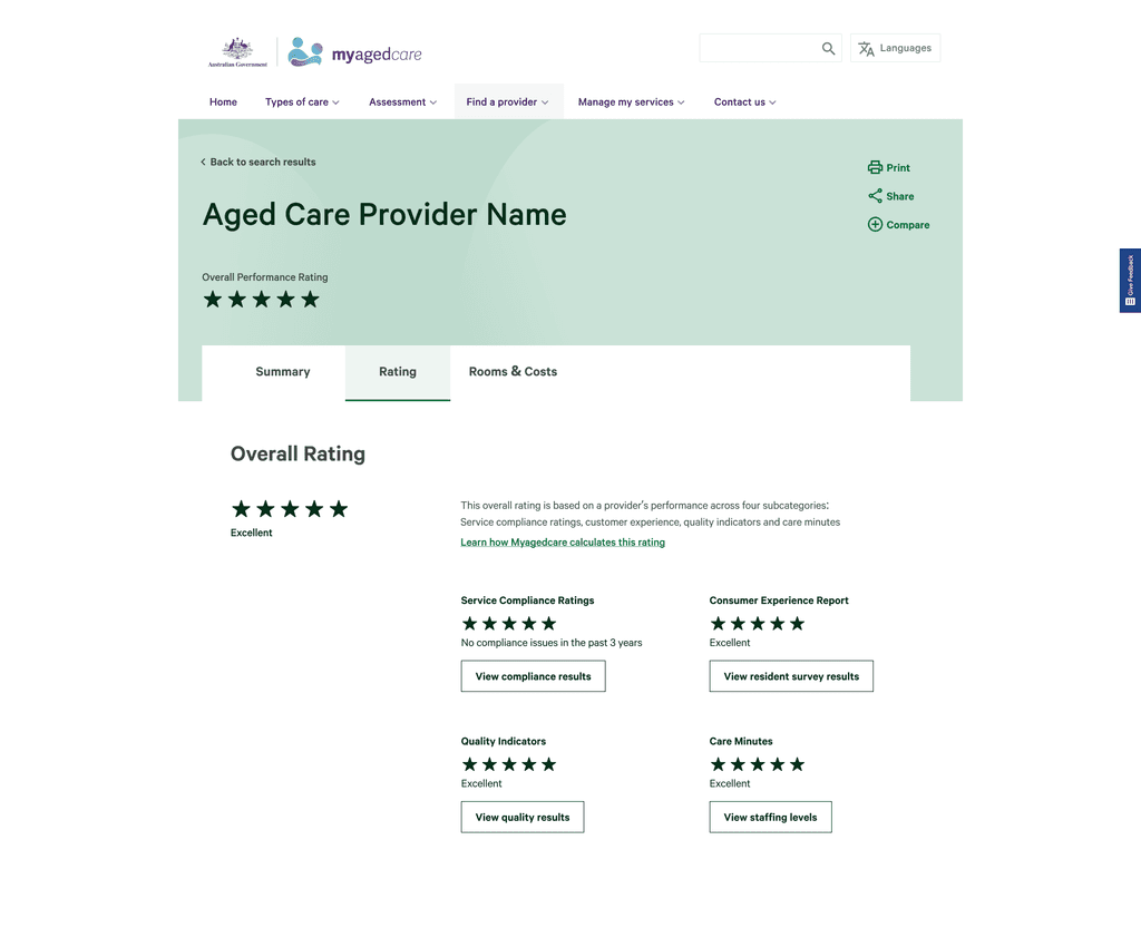
Base the rating on multiple facets of quality, using existing qualitative and quantitative data.
transparent
Educate users around how to objectively interpret, evaluate and make use of the available quality of care data.
ACTIONABLE
LIMITATIONS WITH DATA
dealing with data integrity
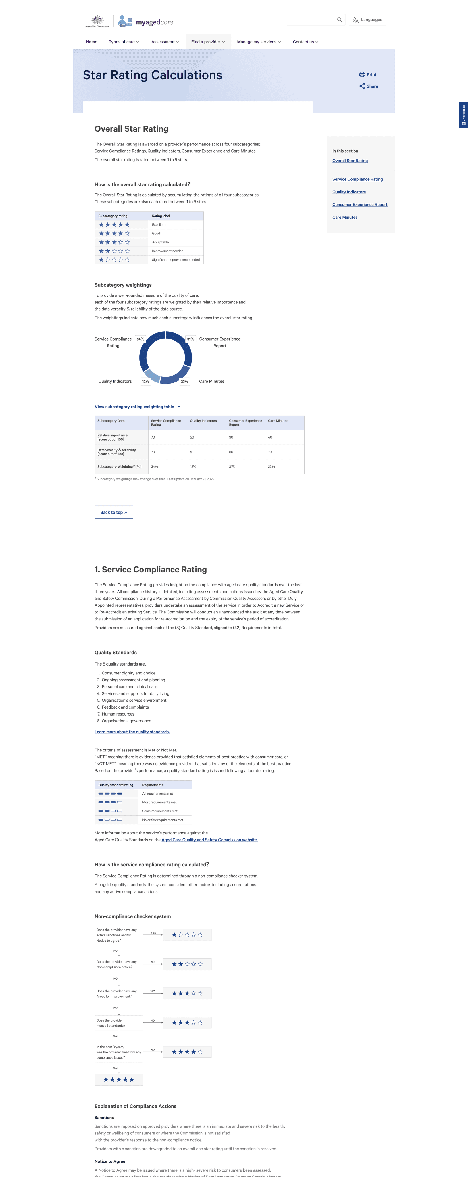
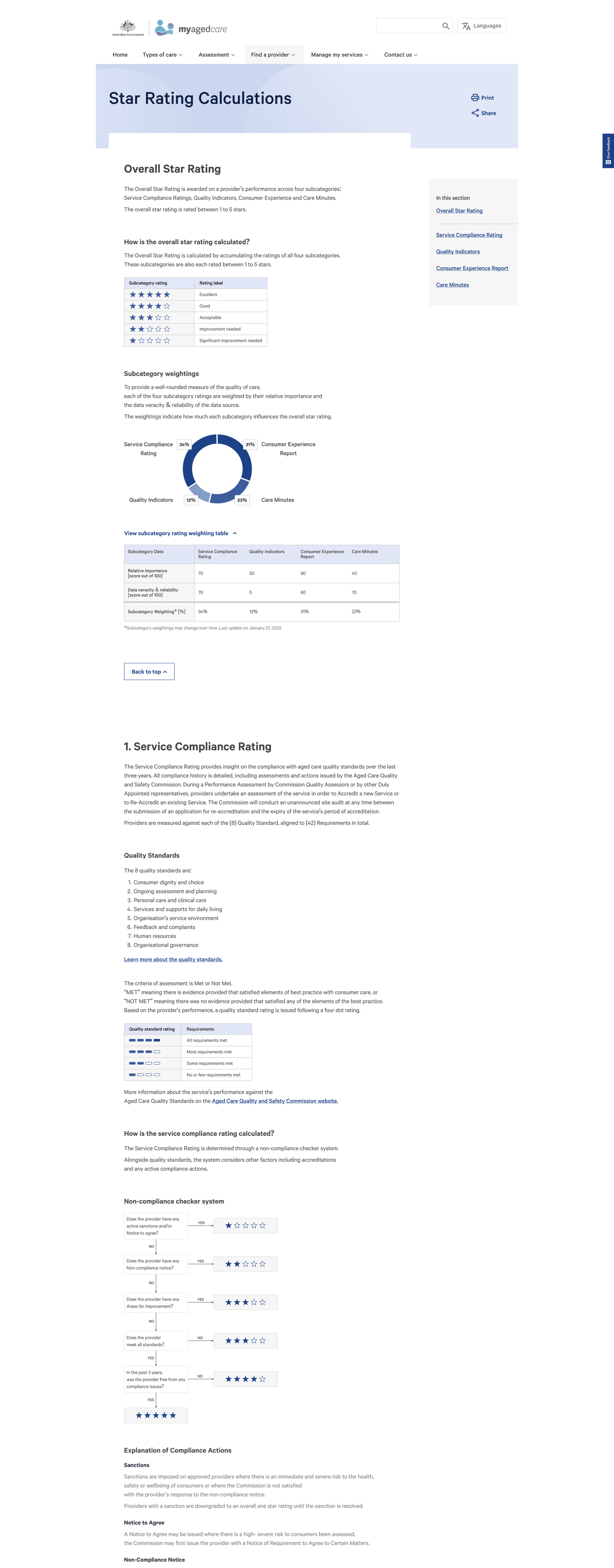
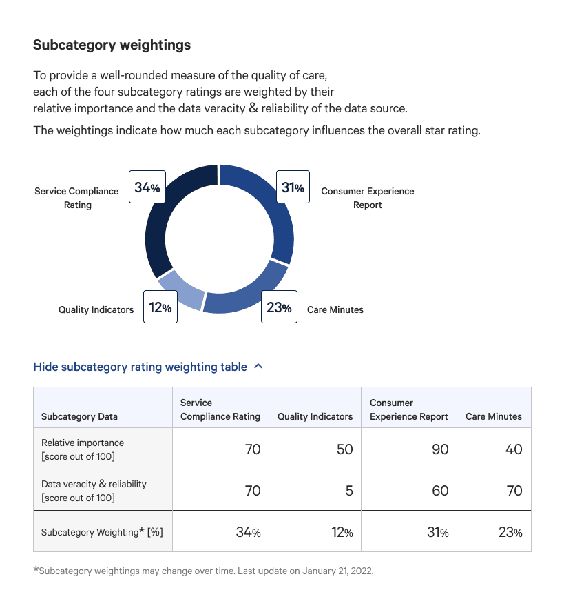
We discovered that many consumer’s lacked trust with existing data. To build trust, we solicited inputs from experts familiar with the data's veracity and reliability to allocate fair subcategory weightings on how much they would contribute to the overall star rating.
A weighting methodology builds a contingency for inflated data and future proofs the system as it can be adjusted alongside data maturity.
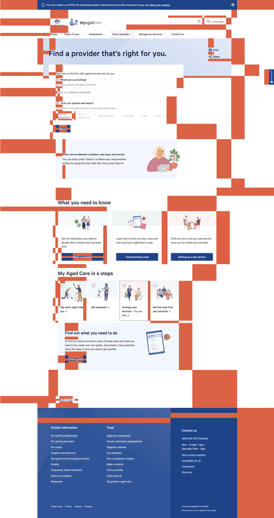
EXISTING TYPEFACE
ABCDEFGHIJKLMLNOPQRSTUVWXYZ
abcdefghijklmnopqrstuvwxyz
1234567890!@#$%^&*()
existing 8 pixel grid spacing
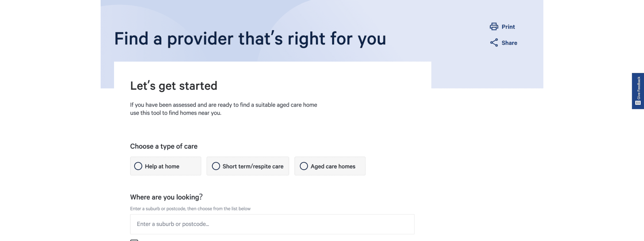
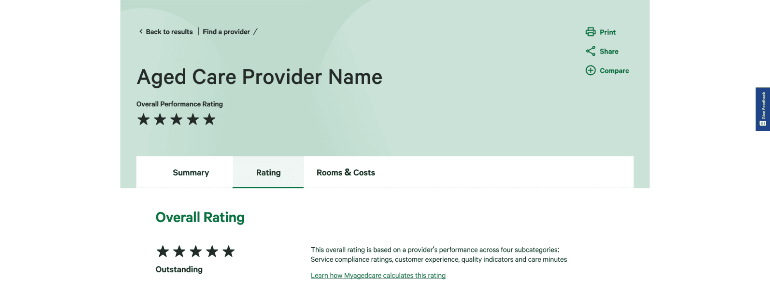
Existing Colour themes
Navigation theme
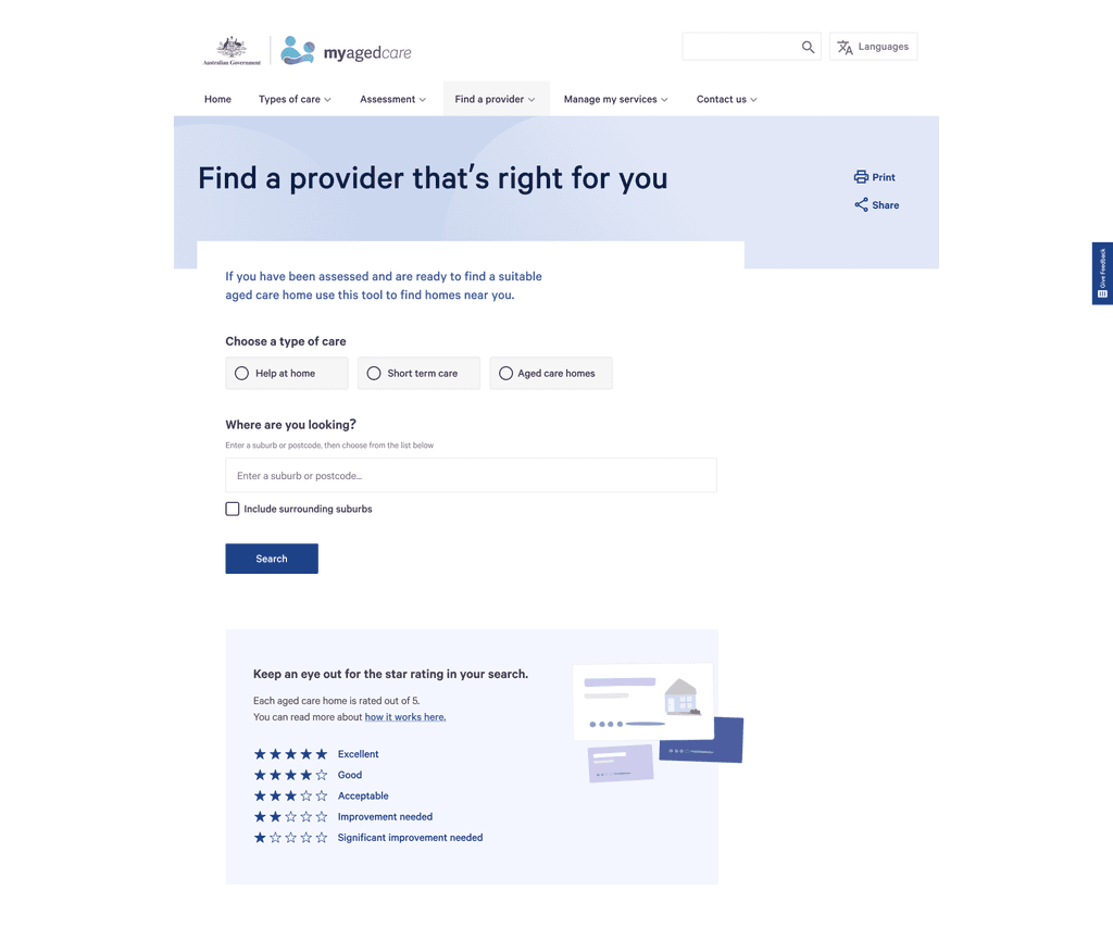
Home page theme
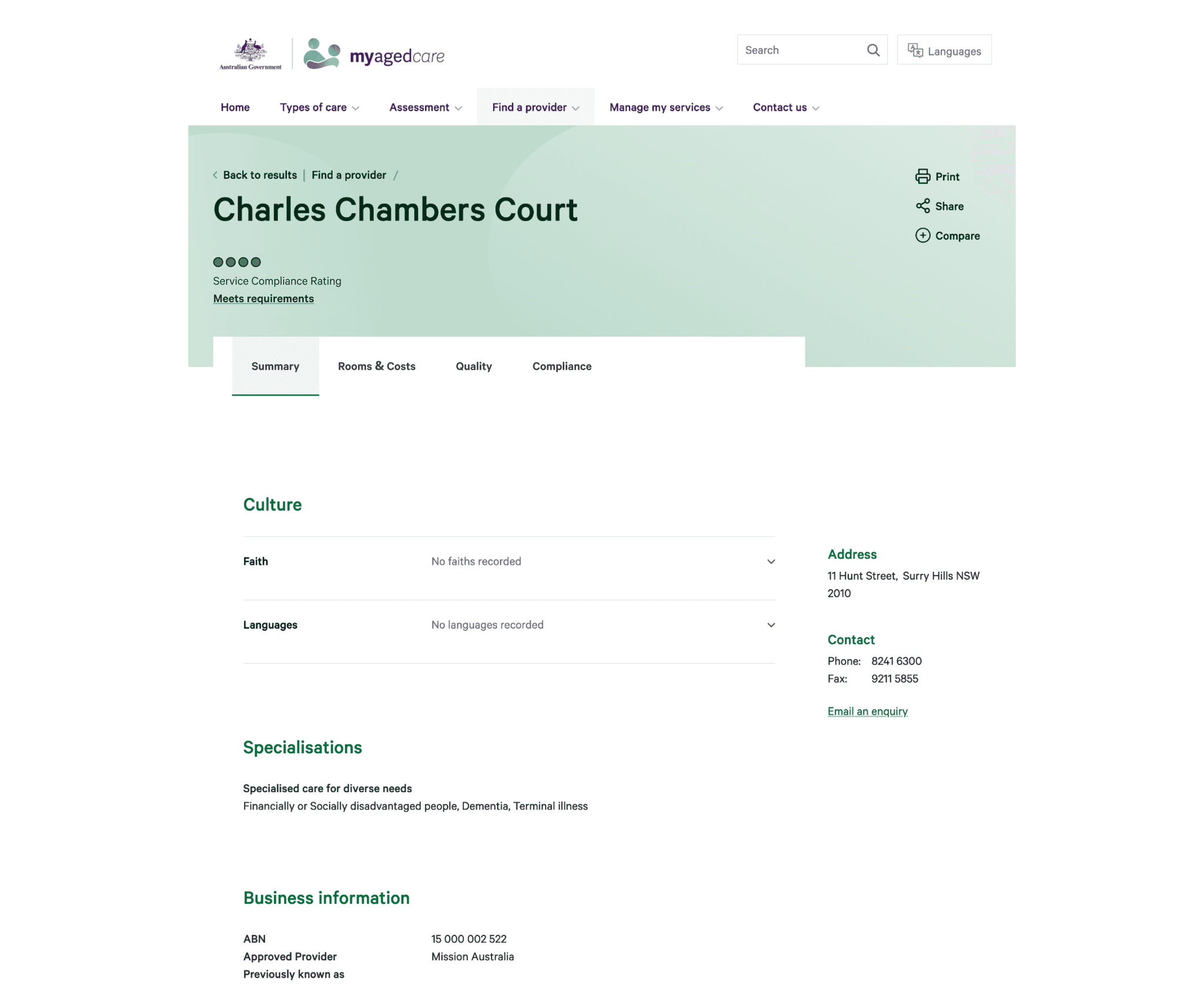
Provider profile theme
BEFORE
COMPARISON BY Location
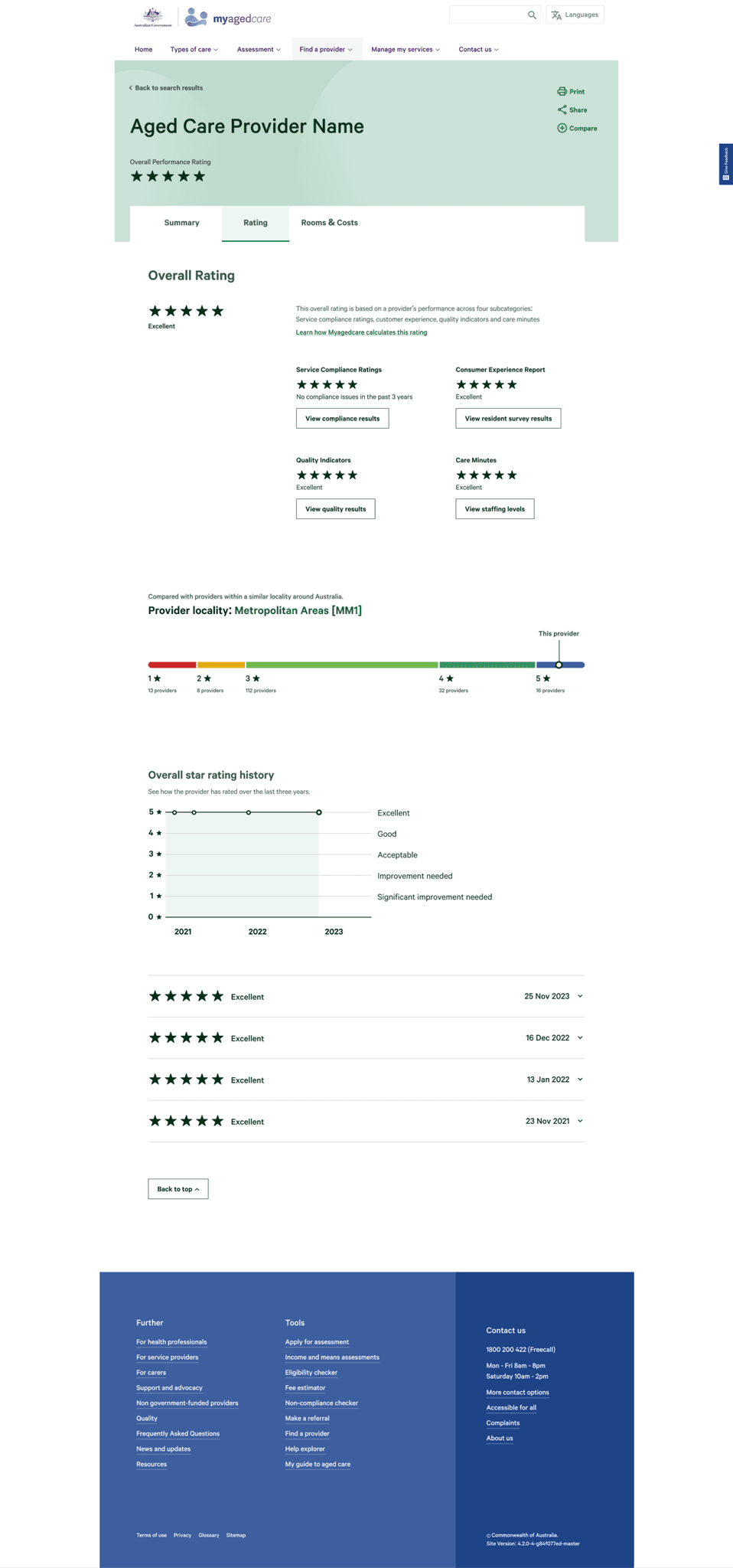
We visualised the provider distribution on a stacked bar graph, highlighting how the provider scored compared with their city’s and national averages.
When we received the data sets, we discovered that the attribute of location was not available. On top of that, users commented that the diagram made the low rated providers look like terrible choices.
Despite scrapping the diagram early into testing, we continued to hear the need to compare providers in a setting that was relevant.
User participant
AFTER
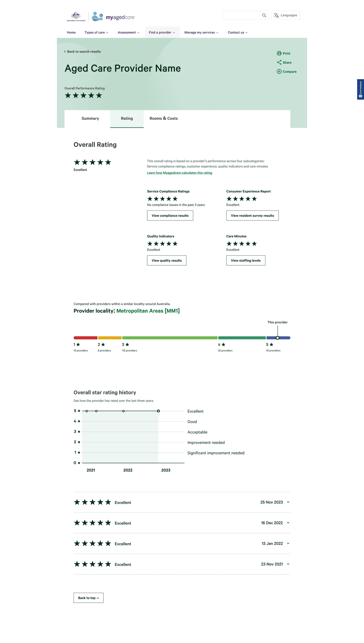
COMPARING BY LOCALITY CLASS
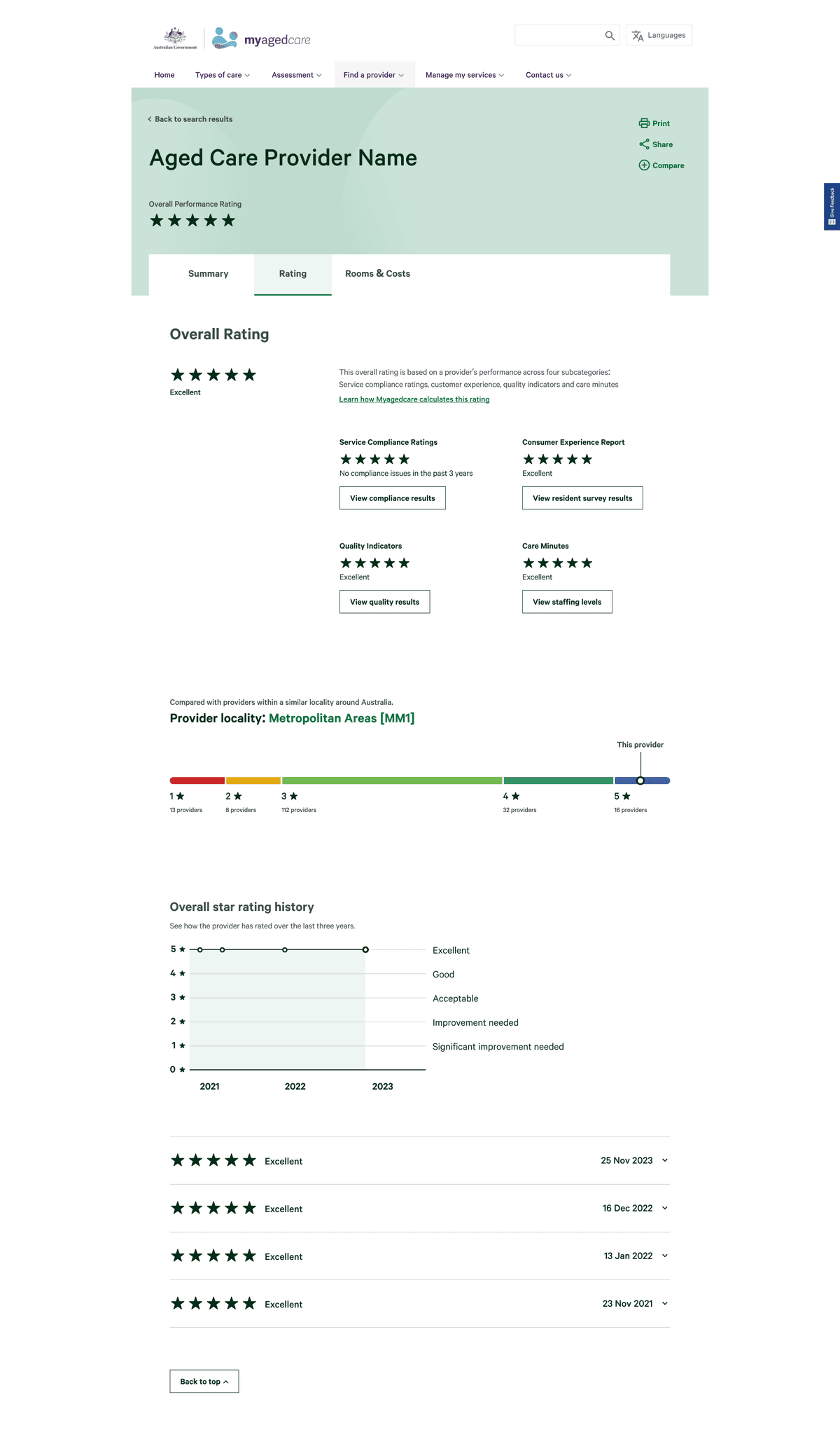
After speaking to many users, we heard the importance of being able to compare like-for-like providers. We discovered the Modified Monash Model classification system, that classifies based on locality types. By filtering the diagram with this system, we can empower consumers to be equipped with the relevant knowledge to make the best decision in their circumstance.
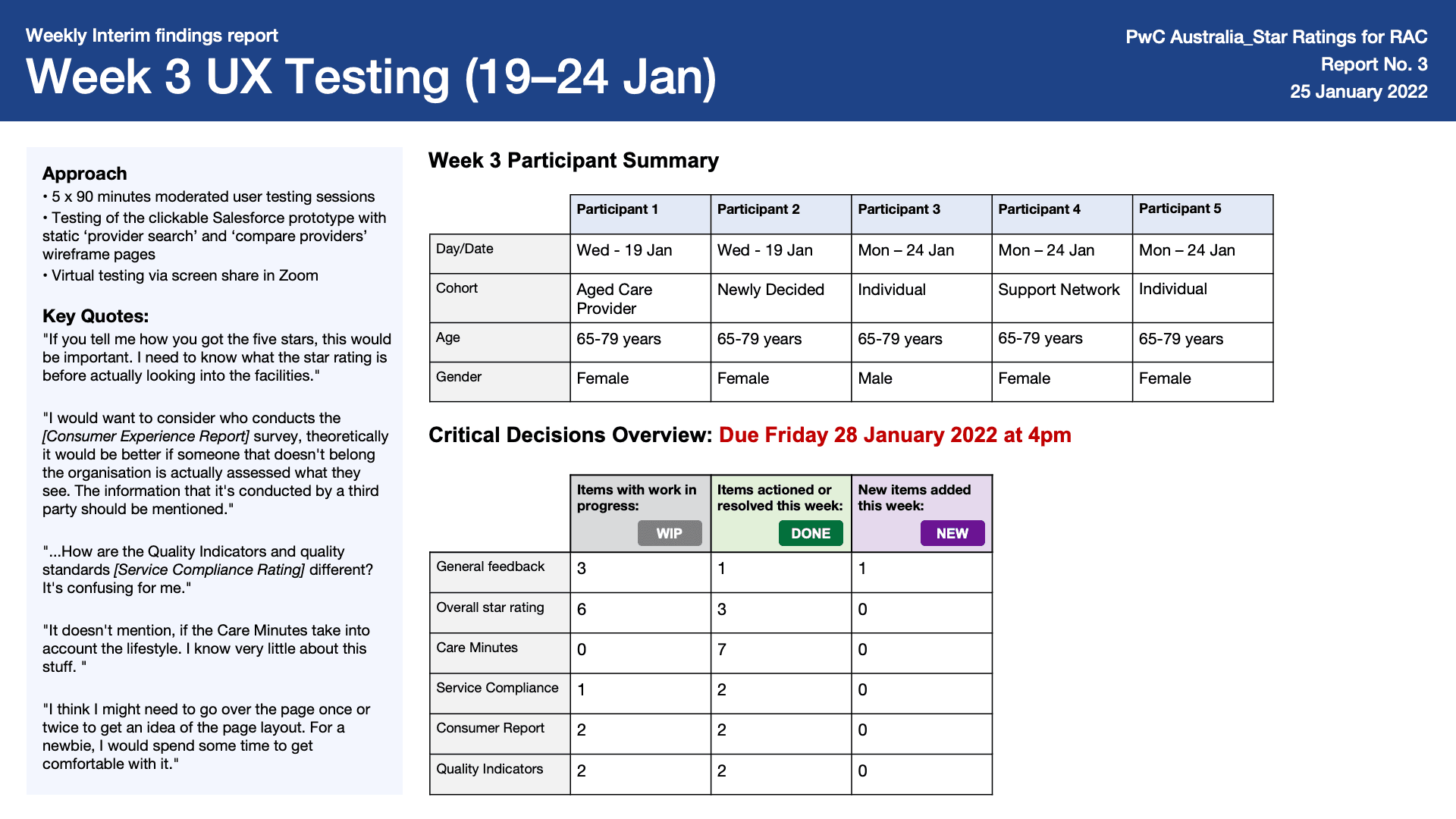
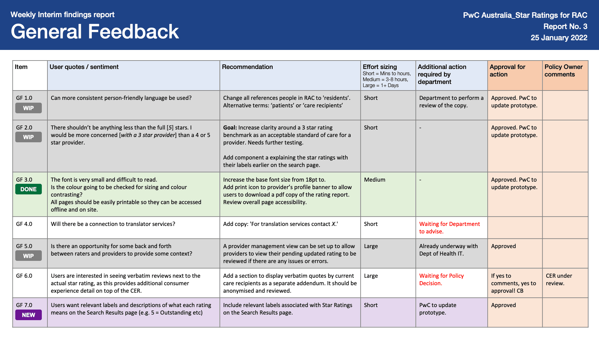
Weekly interim findings report
BEFORE
User sentiment (Item GF 7.0)
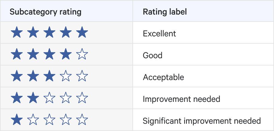
Users want relevant labels and description of what each rating means on the Search Results page (e.g. 5 = Excellent etc.)
AFTER
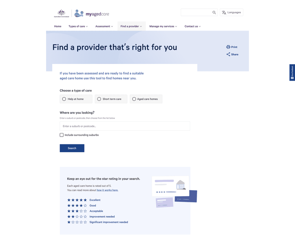
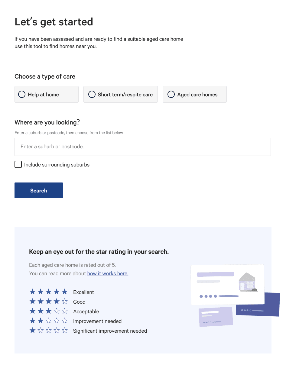
An introduction to star ratings
Users want relevant labels and description of what each rating means on the Search Results page (e.g. 5 = Excellent etc.)
label 1.0
Confidence
Our first set of labels described the level of confidence we had in the data set. This is because we discovered a lot of providers were missing some subcategory data.
Users were confused as to what 'confidence' referred to.

User participant
As a result we changed the rating labels and dealt with the issue of missing data sets by implementing an overall star rating cap based on what is missing.
label 2.0
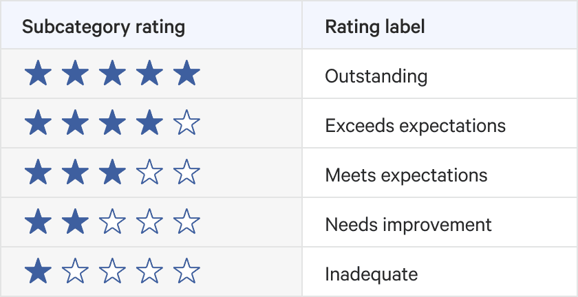
Expectation
For the next iteration of labels, we pivoted to more user-friendly language. However, it was perceived as too casual and interpreted as consumer reviews rather than government requirements.
label 3.0
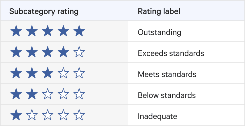
Standards
The next iteration of labels, we used the language of standards to plainly depict their compliance. However, users considered this very strong language and suggested that they would not settle for anything less than 4 star rating, even though for some consumers that is their only option.
FINAL EXECUTION
Acceptable
The set of labels we landed on was somewhere in-between. It doesn’t oversell 5 stars nor scares users away from 2 stars. It was important that we used the language of acceptable for 3 stars to re-emphasise the baseline that was created.
iteration 1.0
Case-mix adjusted values
Our initial design displayed case-mix adjusted values. However, most users criticised how the Care Minute value reported never reflected the actual perceivable amount of care received as users thought it was displaying true minutes.
iteration 2.0
% tracked to care minute target
Instead of showing the case-mix adjusted value, we opted to display the percentage tracked to the provider’s target. The challenge with this iteration is that every provider has a different target. This iteration was the least receptive to users as it lacked transparency and it was confusing how they could not see any indication of minutes calculated.
Final ITERATION 3.0
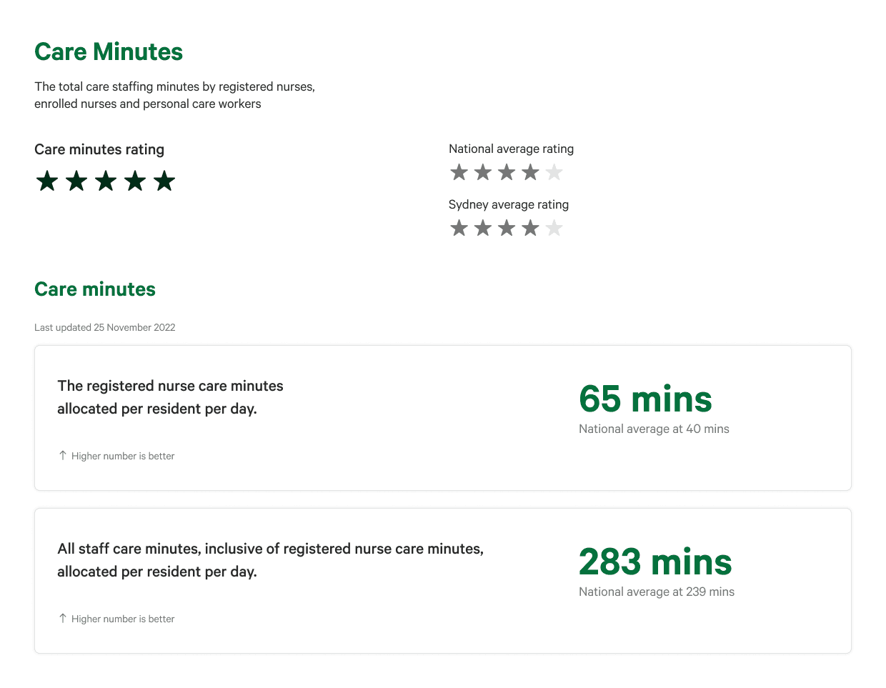
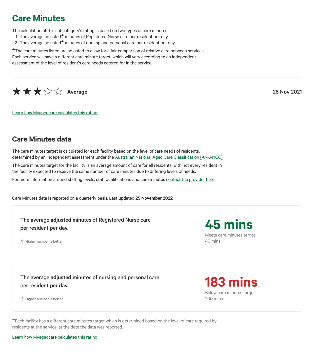
case-mix adjusted values with target label
One thing we learnt through the iterations was both the importance of displaying the right metric and how the metric was perceived. The final design reverted back to showing case-mix adjusted values, supplemented with explanations in the labels and body text to support the user with the correct interpretation of the figures.
CALCULATIONS
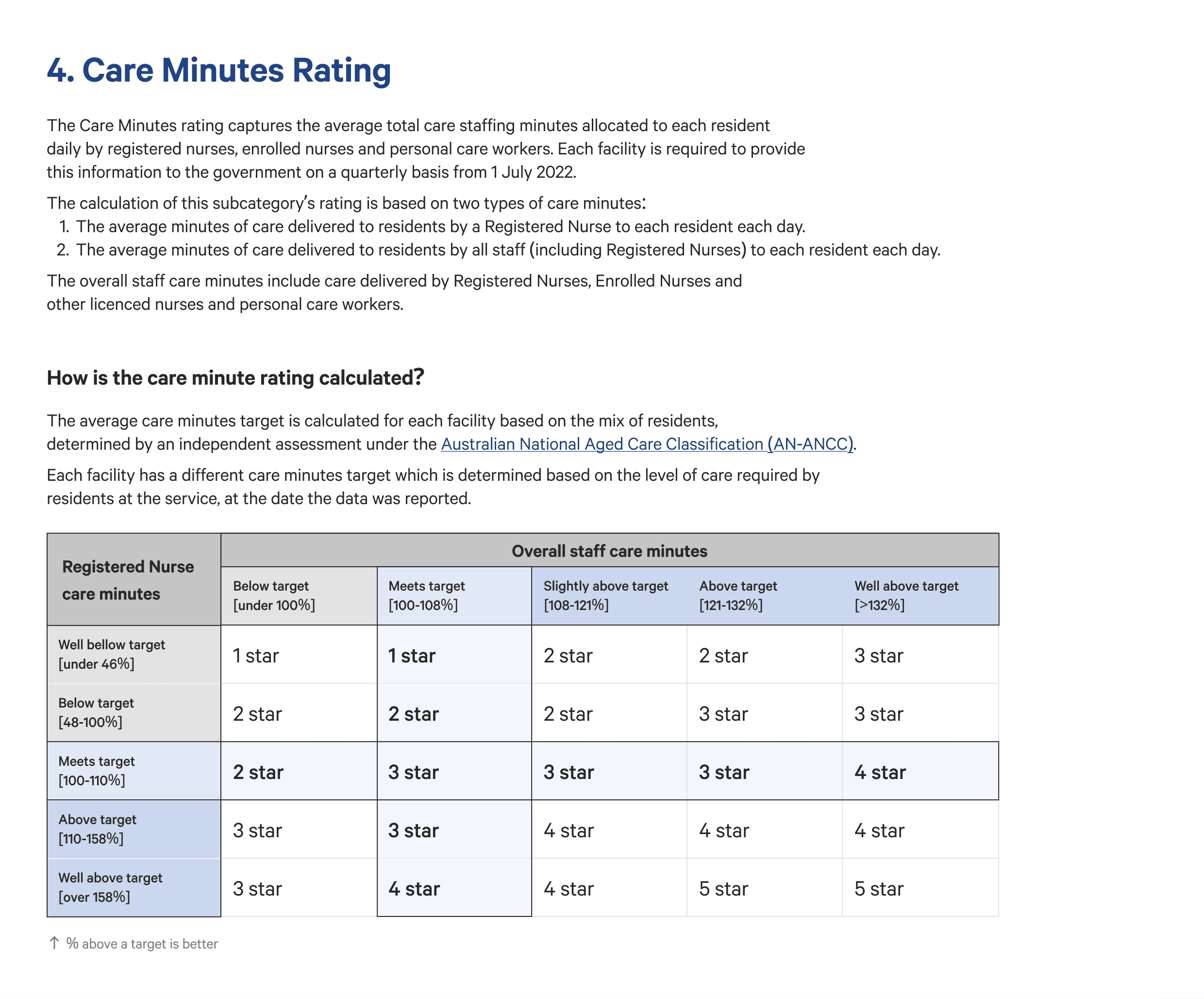
How is the care minute rating calculated?
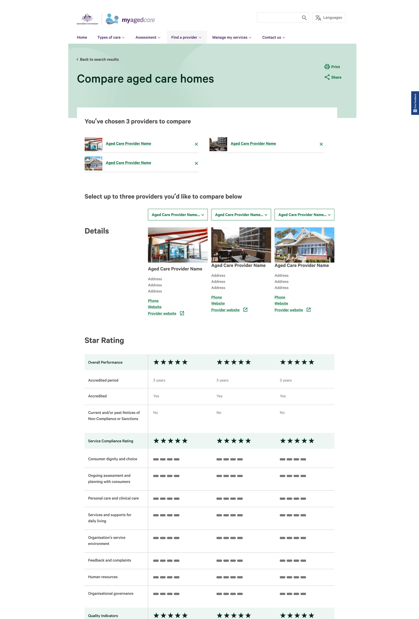
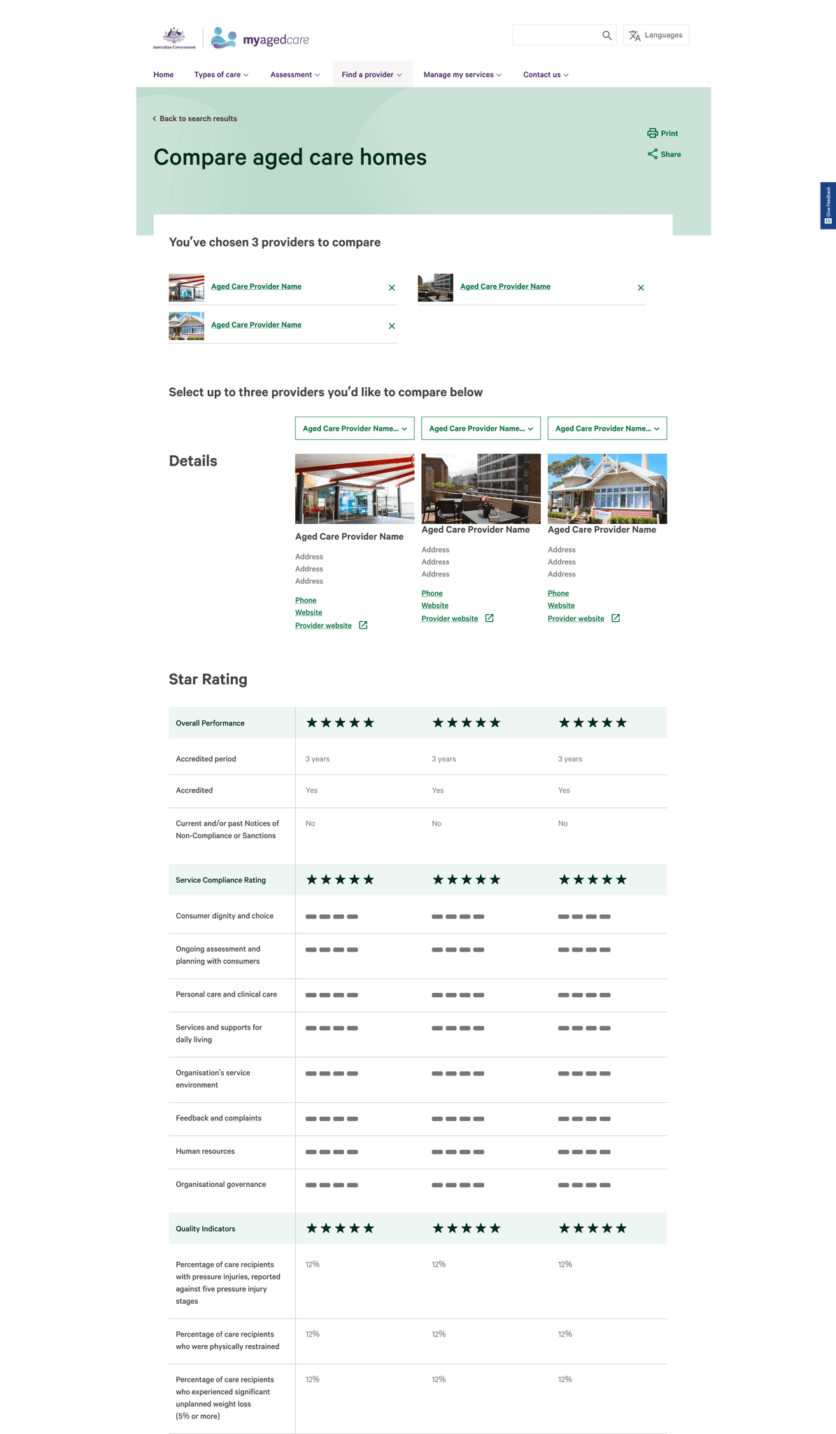
On the calculations page, we used the % tracked to the target as the metric to emphasise that this is how the star ratings are calculated.
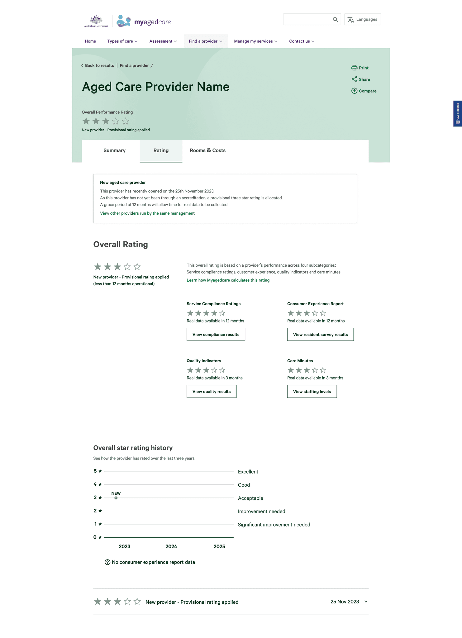
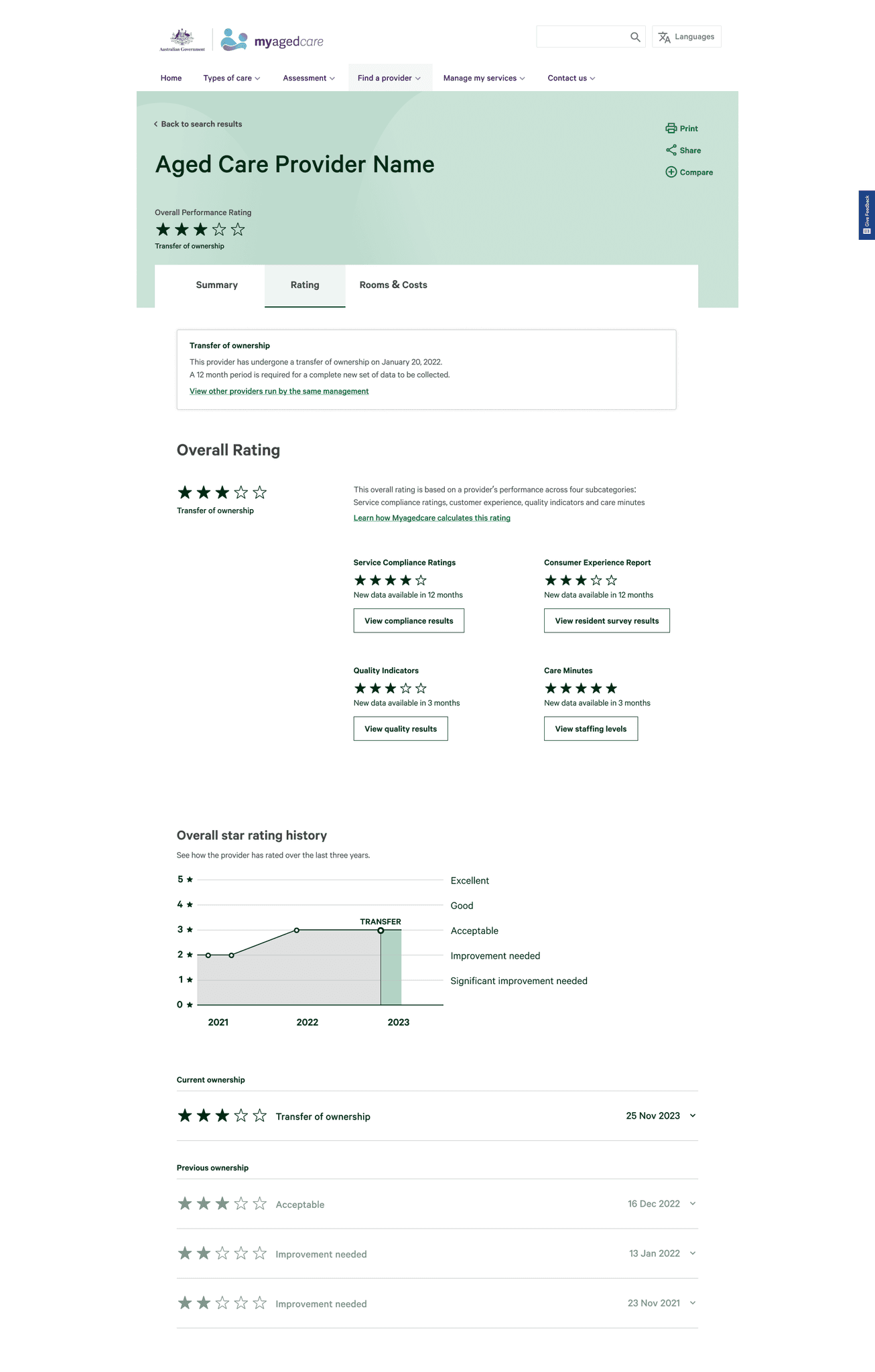
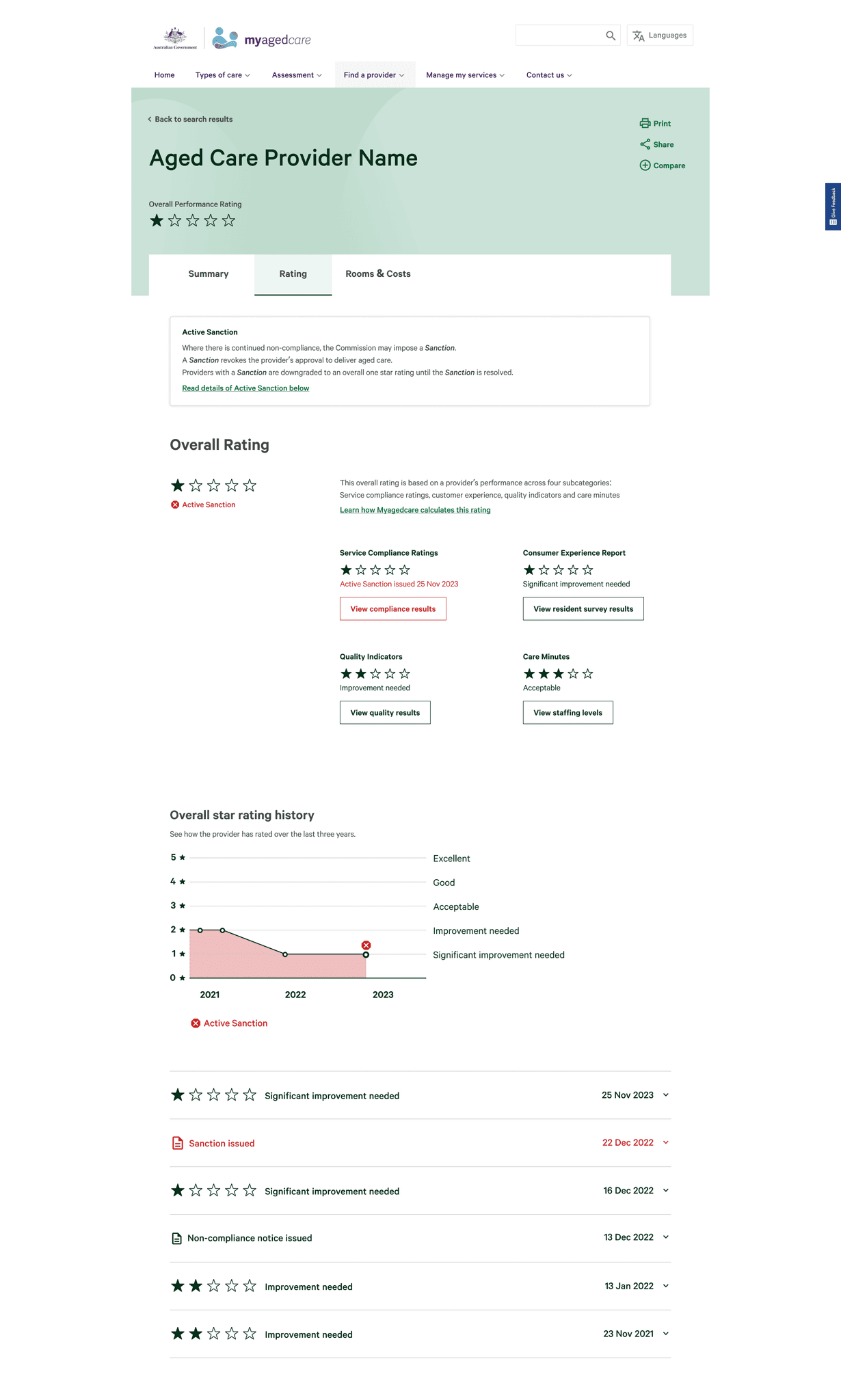
Designing for edge cases
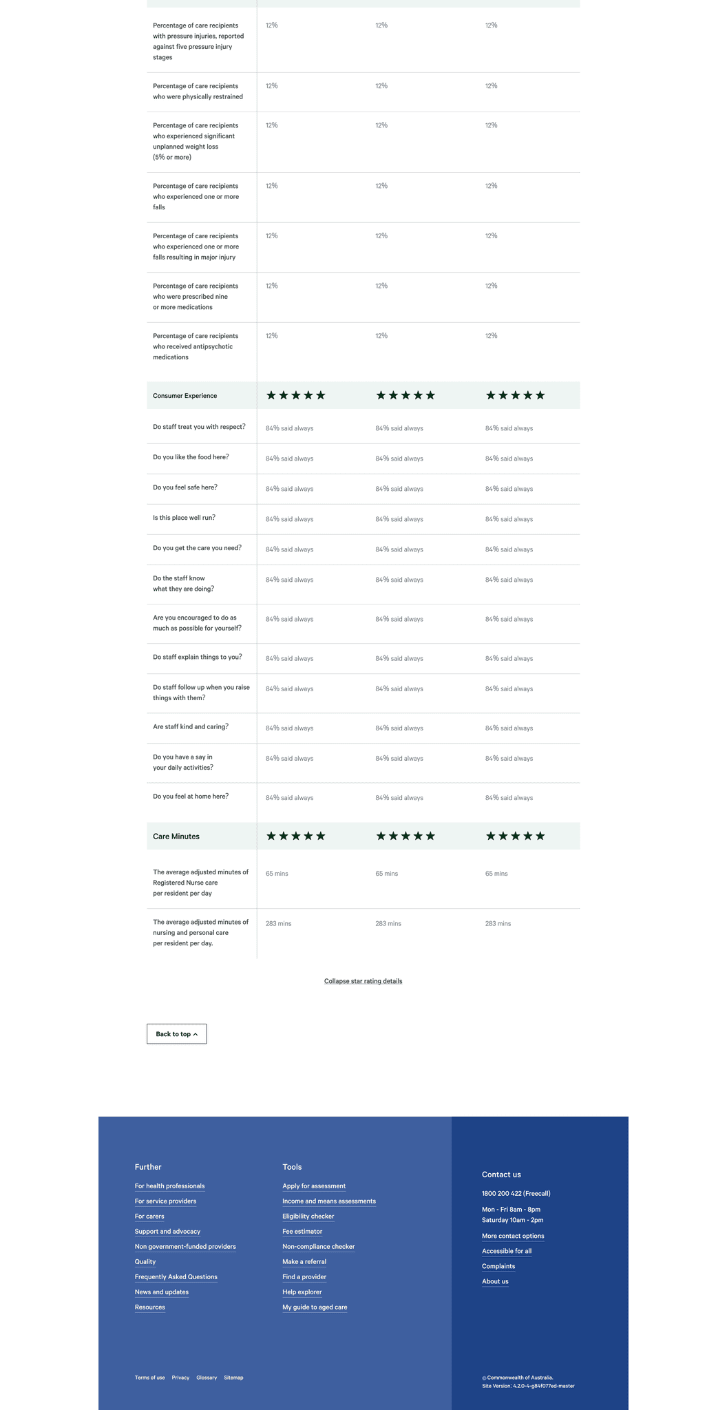
As part of designing for industry-wide adoption, edge cases were also designed and tested to ensure that all providers could be properly and fairly represented.
What the team said about me
Anna Wilkinson
UX testinglead
Nathan has fantastic technical skills. He is efficient, organised and can quickly interpret complex information and present it in a way that is clear and simple for end users. Nathan has presented extremely well multiple times to our clients and has built a trusted relationship with them over time.
Chris Ong
UX/UI stream lead
Nathan consistently demonstrates technical, communication and leadership skills far above his grade. He developed high quality user interface designs, presented his design work to senior executives at the Federal Department of Health, and led other members of the development team, taking initiative where necessary and required little to no oversight in most situations.
Nick Warren
Project lead partner
Nathan was engaged, effective, brought new ideas to the team and began his leadership journey in working with our vacationer. Really pleased with the way you worked and we’ve had great feedback on the video too!

James Martin
Salesforce developer lead
Nathan was excellent throughout our project. He owned solutions and was instrumental in ensuring the projects success. He showed great initiative in working with the rest of the team, ensuring everyone worked together to deliver.
Although we successfully achieved the deliverables and business outcomes set out by our client in this phase, here are some tasks I would undertake with additional budget and time.
re-test the design
with participants
We only tested with each participant once. Because of the project timeframe, we had to rapidly iterate the design which consequently resulted in users of different testing weeks seeing different designs. I would love to go back to all participants and show them the iterations and further test whether some of their hypothesis or concerns were resolved by the opinions or ideas they shared.
For more rigorous testing, I would try engaging with a greater variety of participants to build personas such that the star rating representation can provide more value: people of different cultures, people with English as a second language, people of disability, people from rural areas, people with only access to one care provider. etc.
re-TEST the experience
once connected to live data
building a product roadmap
of supporting interfaces
Although this project was initiated as part of a greater industry-wide aged care reform for Australia, we only designed and tested the interface for end users.
Now that the project has gone live, it would be productive to revisit the project and see what other supplementary interfaces could leverage this system. One example being an organisation portal that could show all the providers an organisation owns, the provider star ratings, the ability to manage and track data reporting timelines, a view on how providers compare with others in the area, recommendations and steps to improve star rating. etc.


