Defining the scope
The project team was tasked with the design and build of a new star rating system on the existing myagedcare website. Without access to the design system, I was tasked with rebuilding the brand styles within Figma so that our designed concepts would feel familiar to user testing participants.
Rather than rebuild the entire component library, I prioritised my design effort by limiting the library build to what was only essential for the testing of the experience.
Prioritising design effort
I first needed to determine the number of high-fidelity page designs required to satisfy the project requirement of testing the new experience.
BUILDING THE user testing flow
Working with the UX testing lead, we determined a user testing flow that would form the basis of the user testing sessions.
The scenario walks a user through:
- searching a provider
- filtering the search
- comparing providers
- understanding how the star ratings are calculated
pages to be designed
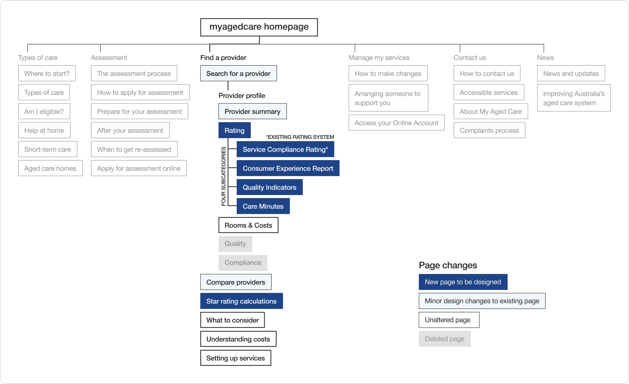
From this flow, I decided upon six key wireframe pages and three subsequent pages that only required minor edits.
revised site map
Extracting existing styles
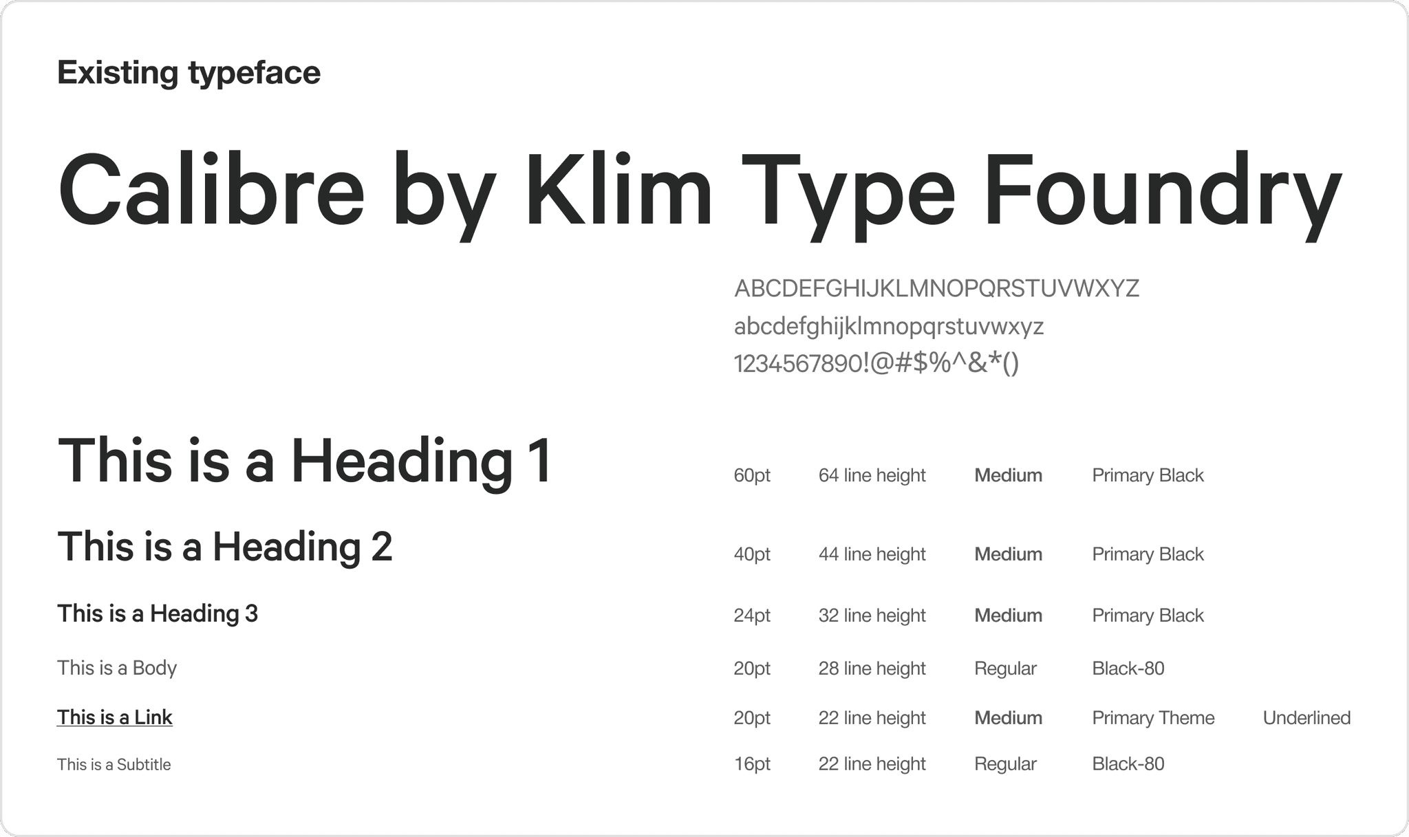
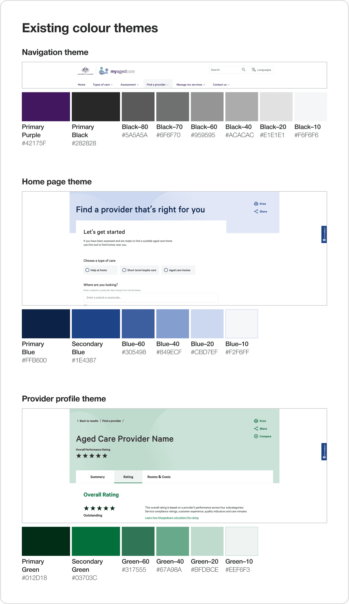
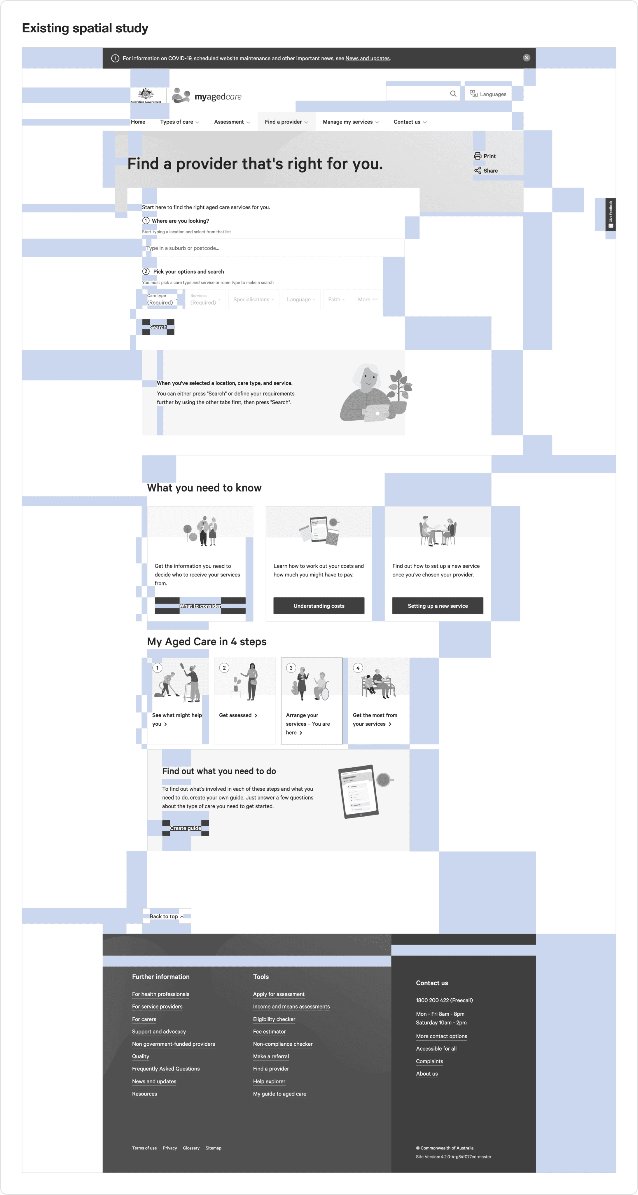
Using the inspect tool on Google Chrome, I extracted and documented colour hex codes, the existing typeface and the typographic scale to build Figma styles to build my wireframes. I also studied the 8 pixel grid and spacing patterns of the existing components to ensure I was designing new components in a similar design language.
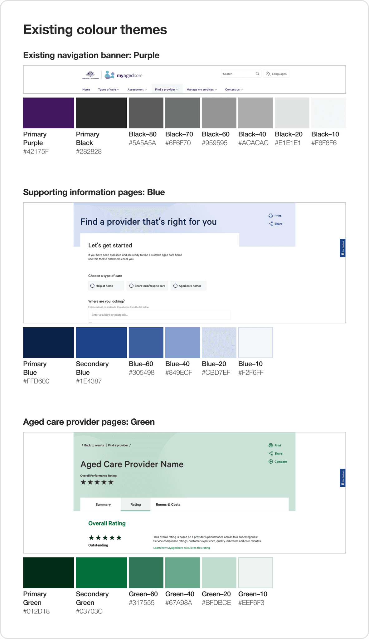
Existing colour themes
The existing colour styles were broken down into three colour themes: purple, blue, green.
I assigned the corresponding themes into the design of the new pages:
key provider pages as green and the supporting pages as blue.
Existing typeface
Typographic style sheets were created for desktop.
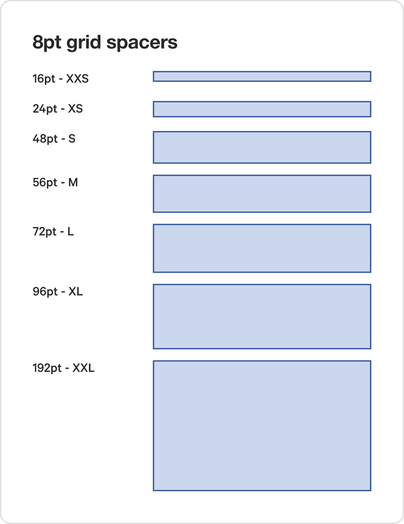
Existing grids, spacing and padding
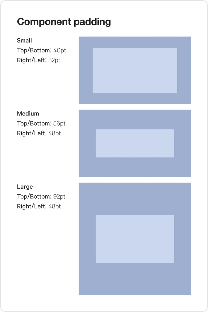
The spacing on the original site followed an 8pt grid. I built out spacers and component padding guides to lay out my designs and build consistent components.
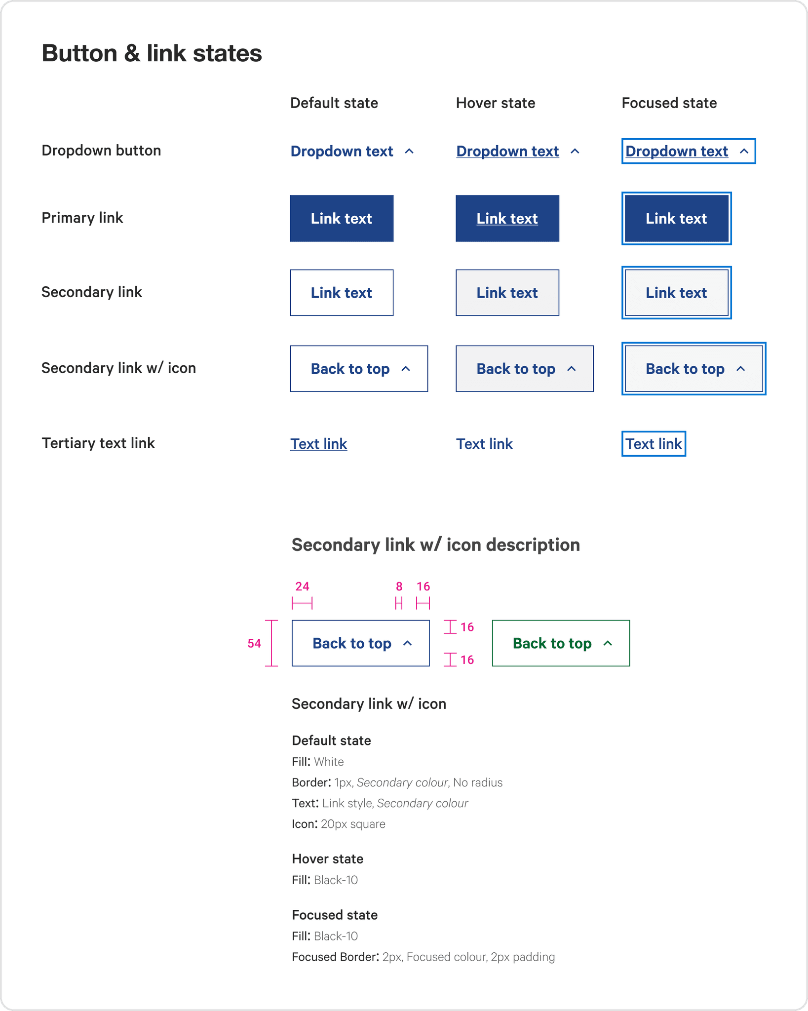
Button and Link states
The button shape and link stylings were extracted from the existing site. The type style is 'Link' and the colour style is the 'Secondary Colour' dependent on the page's colour theme.
The existing website did not include a 'Pressed' state and the 'Disabled' state was not required for the experience.
Compiling the
component library
To suit the nature of this project, I prioritised testing design concepts and ideas first. Once some designs were tested and were moving to build, I compiled components together to create a consistent style across the pages.
Table design
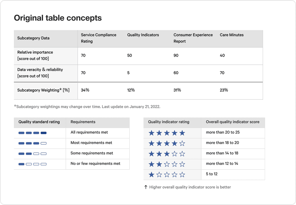
Draft table design
To design rapidly, I focused more on testing the structure of the table and the display of information rather than the styling.
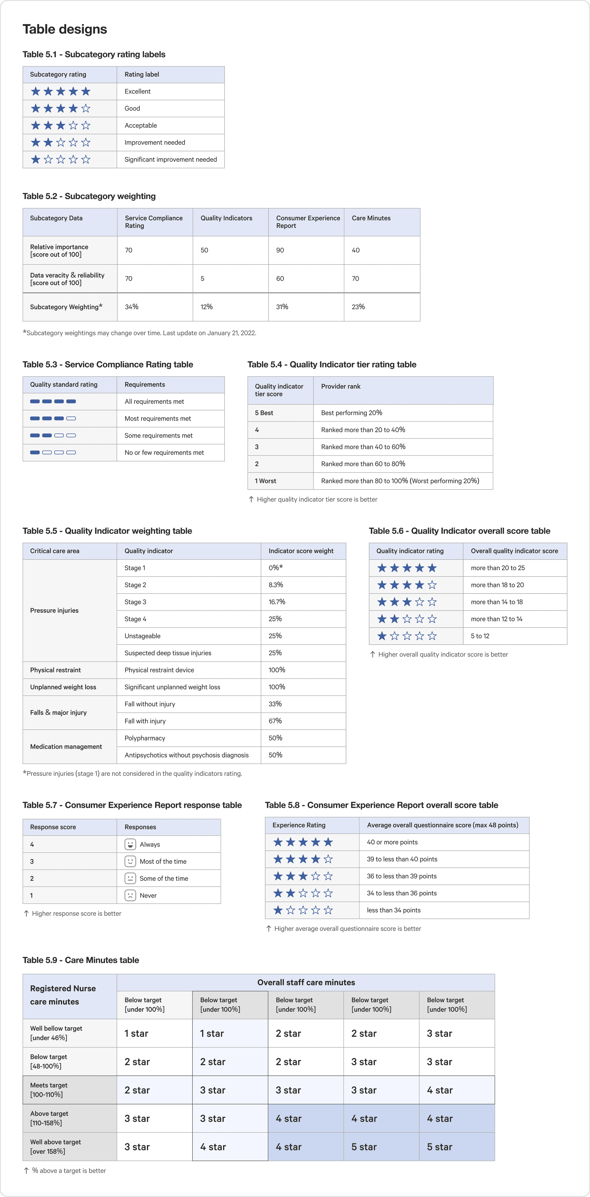
Final table design
Moving to build, I consolidated the table designs with consistent colours, type styles, standardised column widths and spacing.
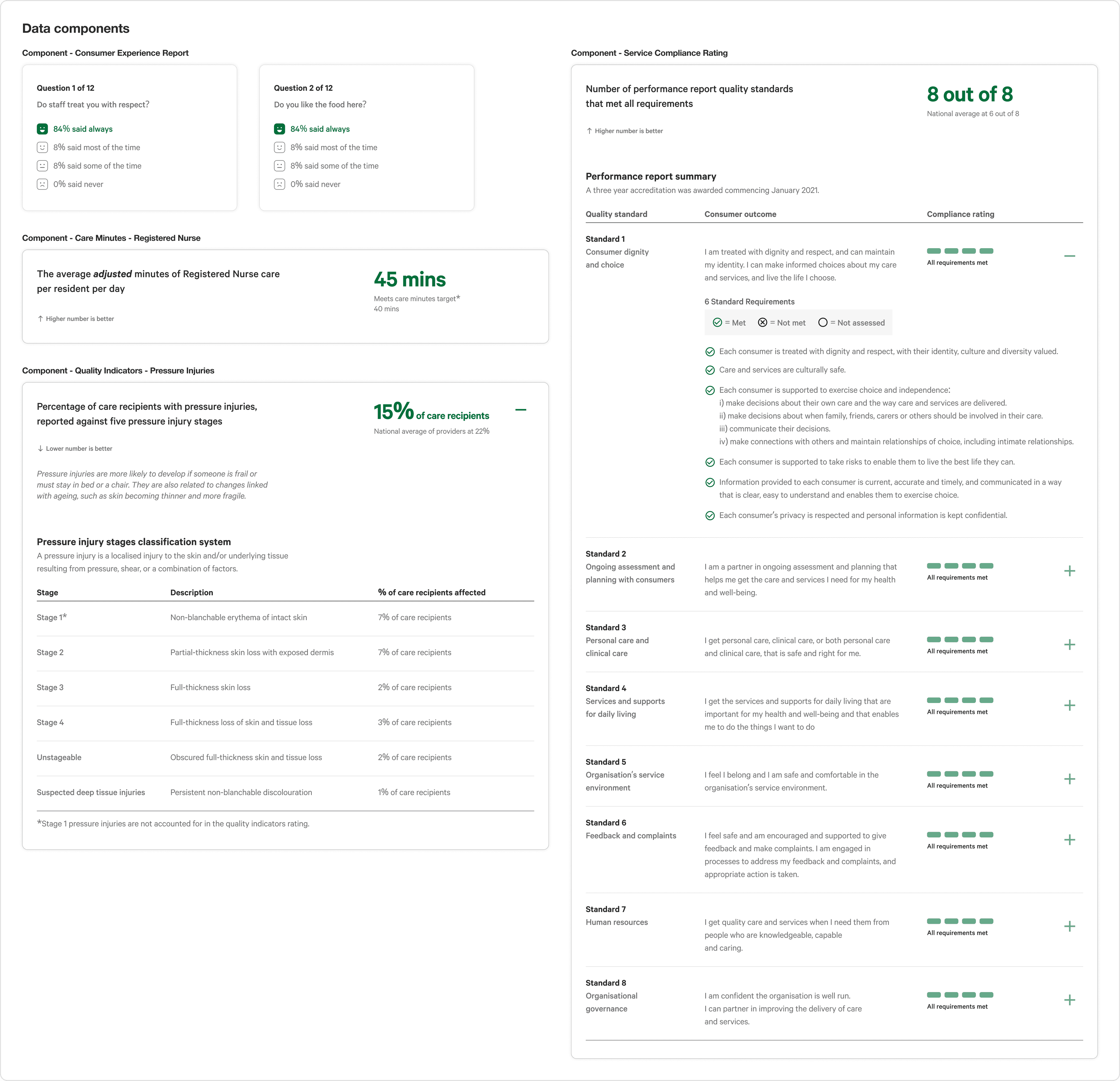
Final data components
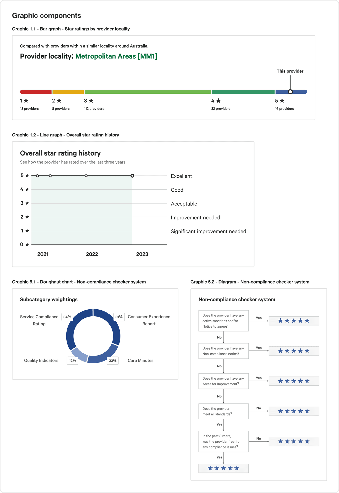
Final graphic components
Executing with the
component library
Redesigning the header component
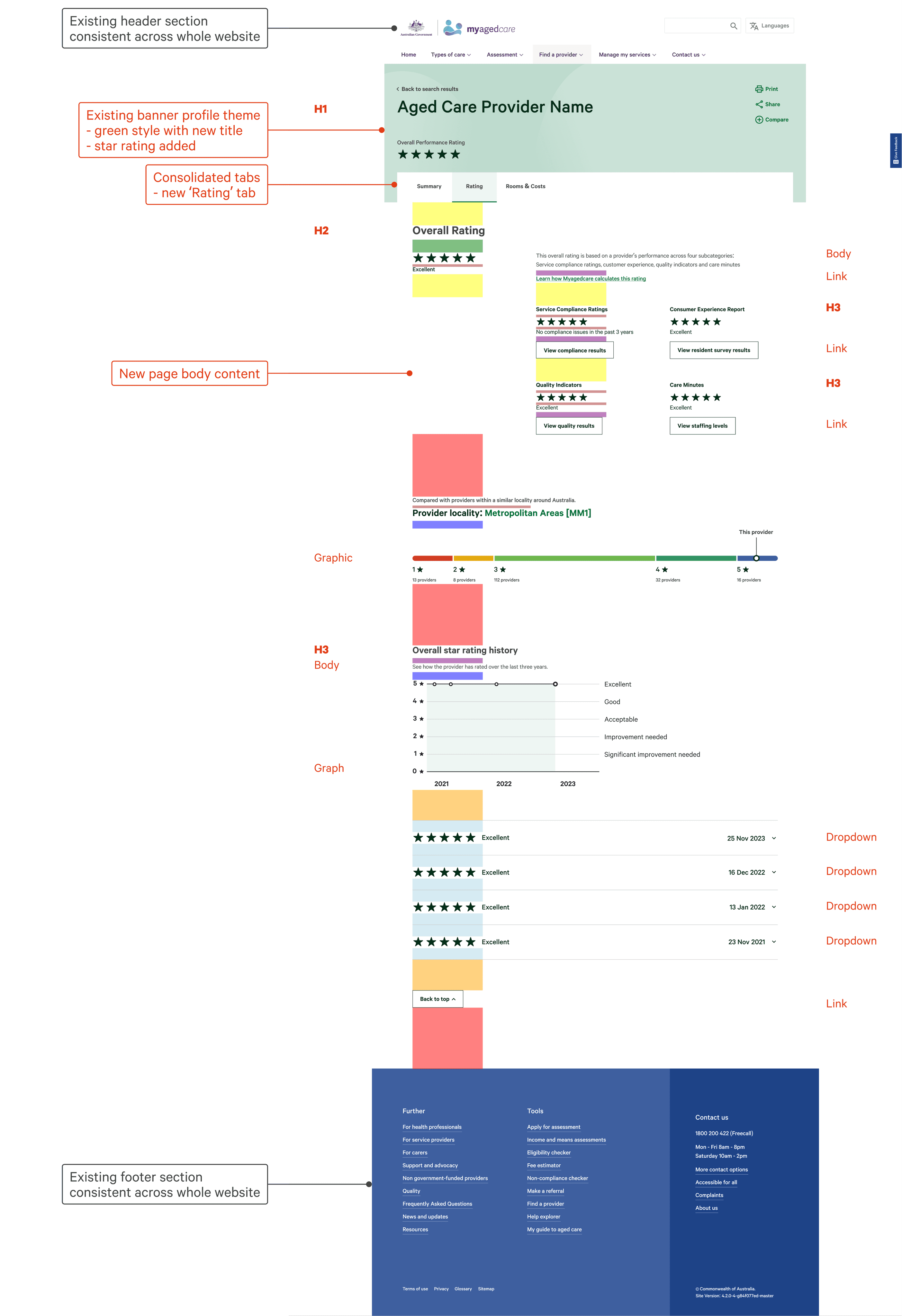
The header component was redesigned to replace the existing rating system with the new five star rating system.
Existing profile header
New profile header - Profile Theme (green)
New calculations header - Page Theme (blue)
Structuring new page designs
Designs were created using the existing type scale and spacers.
Personal reflections
This was a very strange project for me as I would presume that most designers would have access to either the existing design system or brand style guide. Nevertheless, this project enabled me to practice adapting my design methodology to suit the project needs.
The right time to Compile
the component library for build
I was challenged to consider when the right time to compile the components were. By holding off the build at the start, I was able explore different design concepts and representation styles in low-fidelity without the worry of perfecting pixels. However, once I moved into the build and consolidated the styles, it enabled me to iterate more quickly and see the designs to come life in the prototype.
Working separate from
The original website designers
One of the perks of not being on the original design team of the website is that I am not bound by some of the design constraints that they may face working with their style guide. This enabled our project team to explore ideas and changes that best suit the star rating experience for them to consider.
